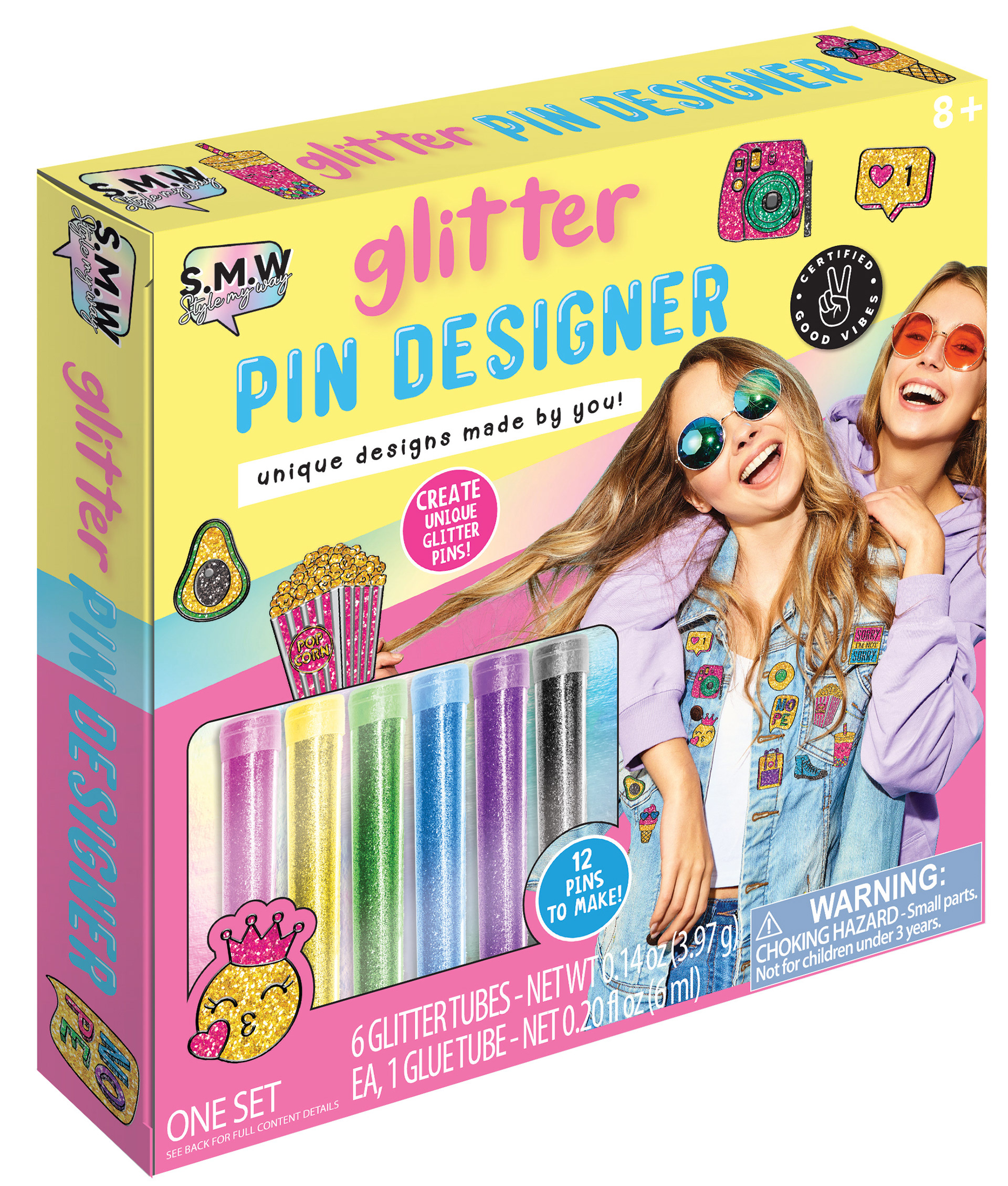
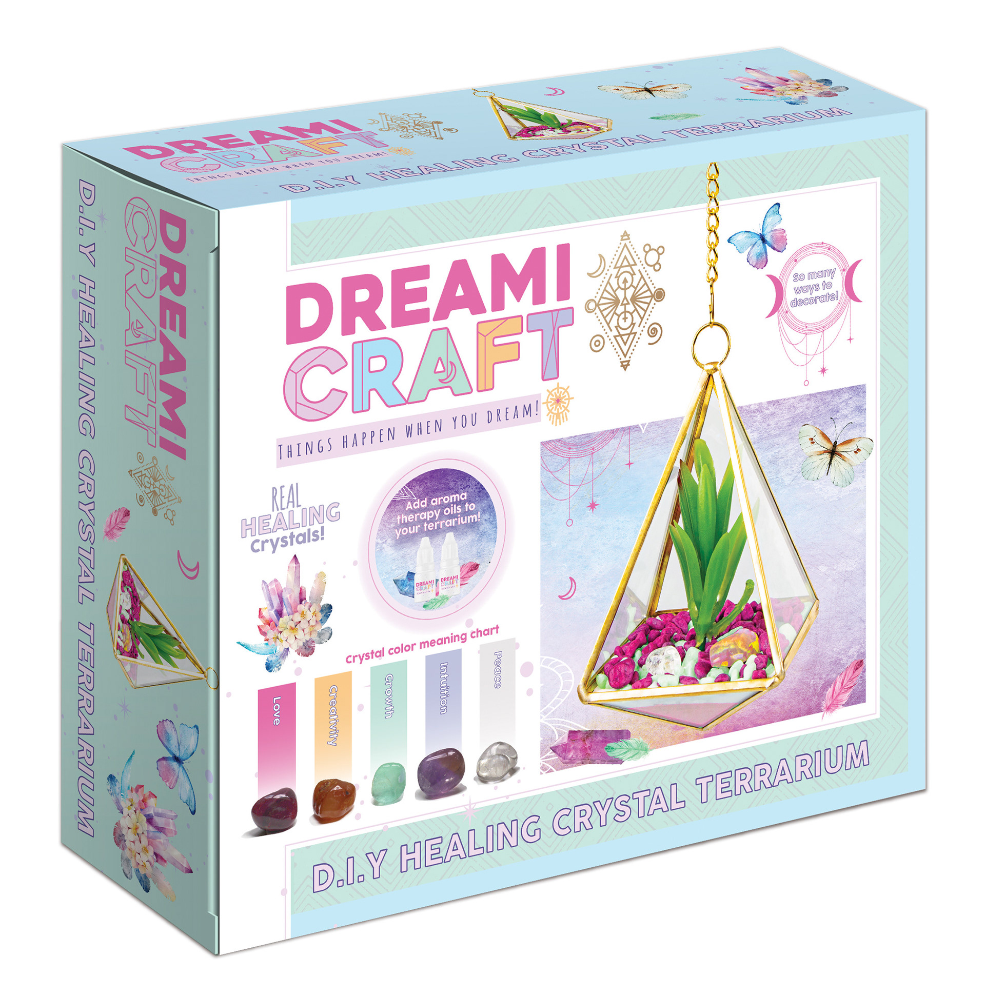
About My Role at RMS International
RMS International is a global supplier of toys, crafts, and games for all ages, with products available at major retailers such as 5 Below, Target, Walmart, Family Dollar, Christmas Tree Shops, Michaels, and Big Lots, among others.
During my time at RMS, I’ve had the opportunity to work on a wide range of product and packaging designs, contributing to lines that reach a diverse consumer base. My role has allowed me to grow significantly as a designer—both creatively and professionally. I’ve enjoyed the challenges, the fast-paced environment, and the chance to bring engaging, imaginative products to life.
Below is a selection of packaging and product designs I’ve developed as part of my work with RMS.
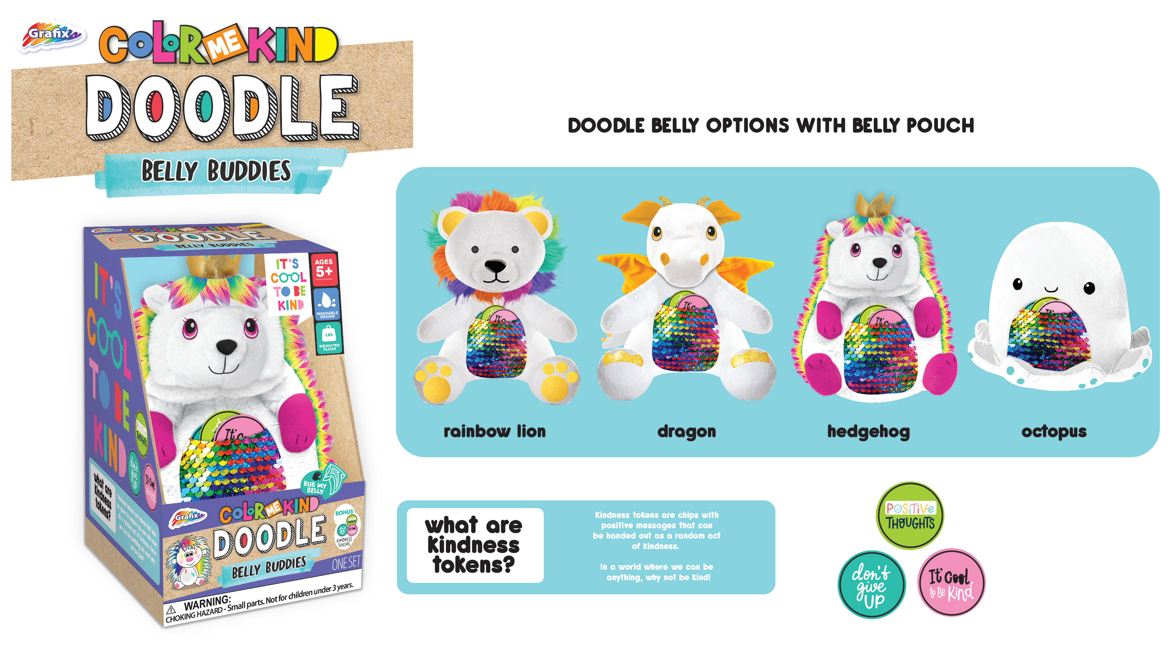
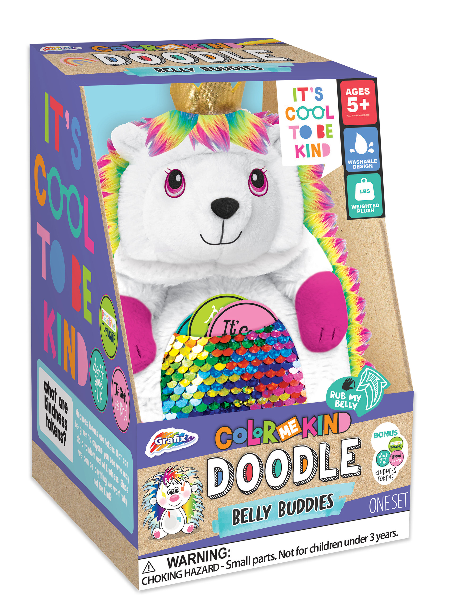
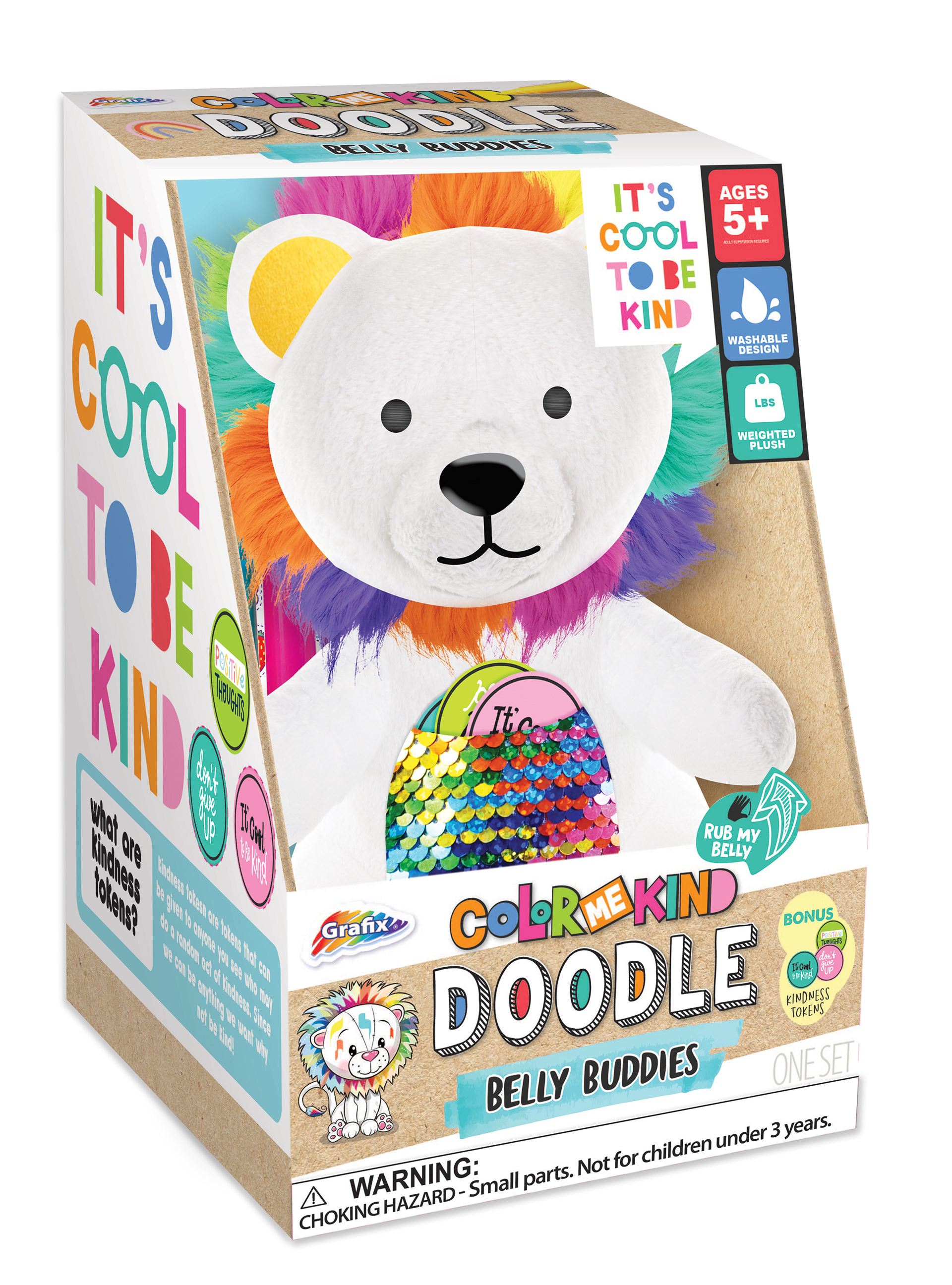
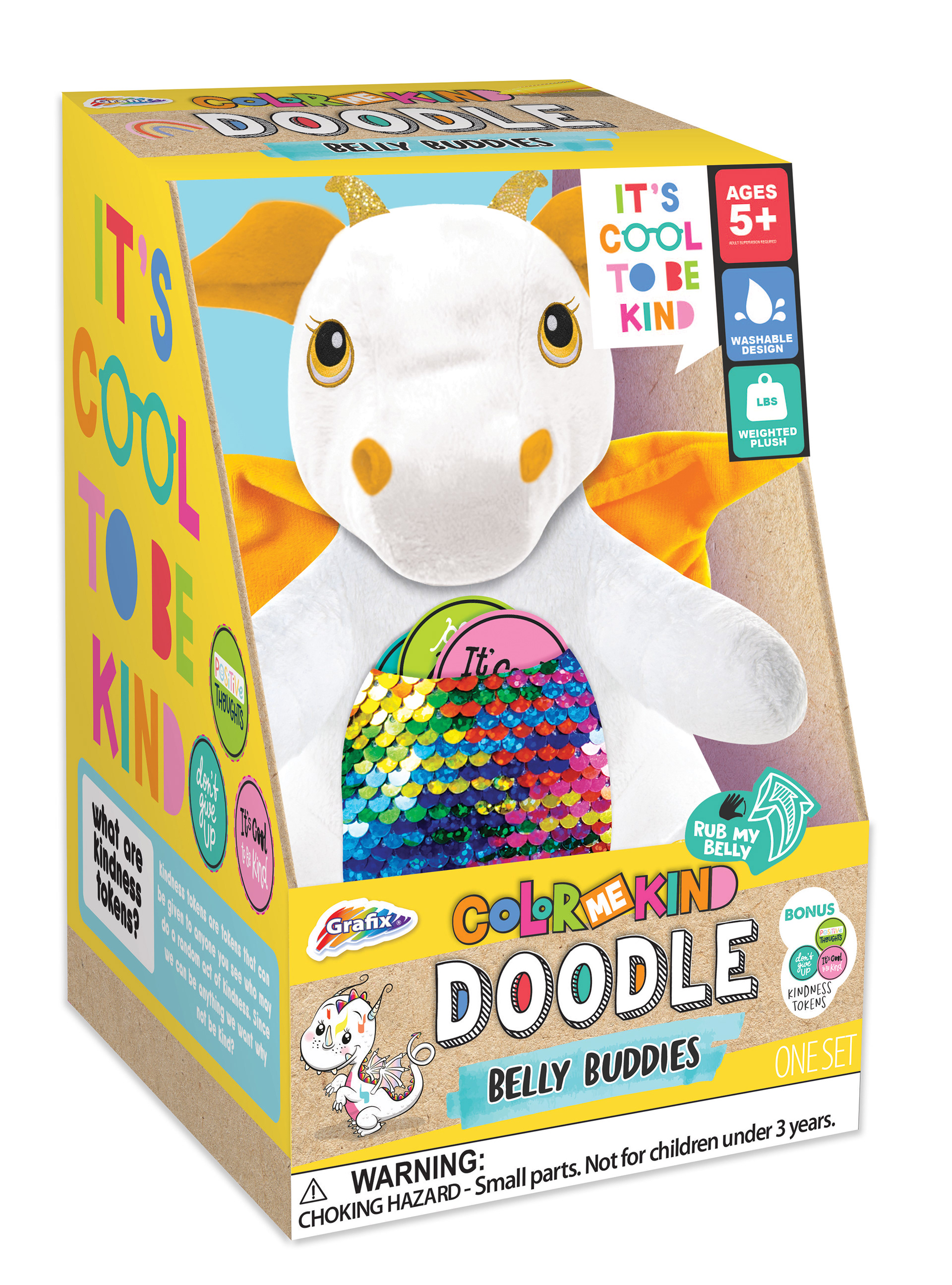
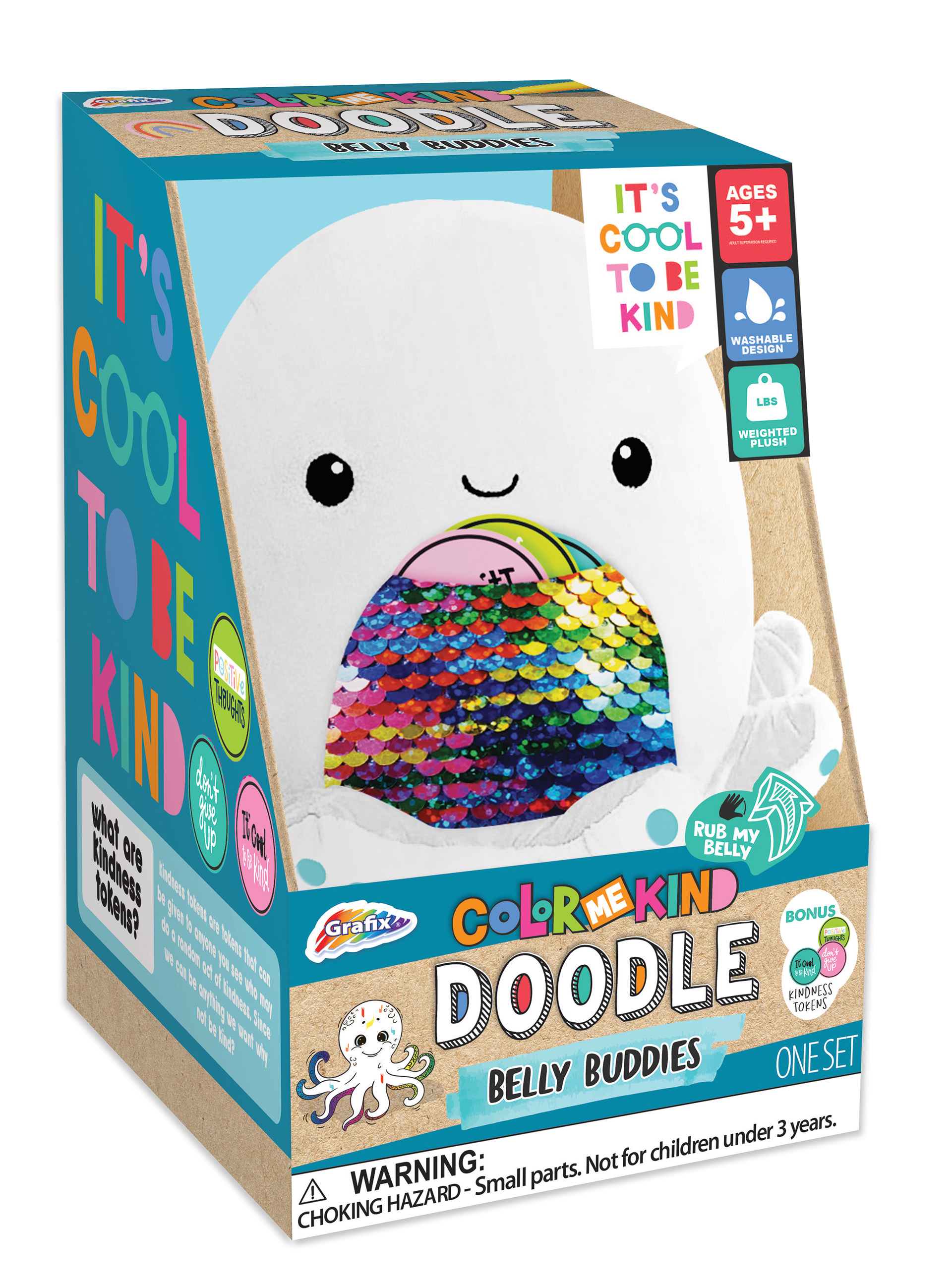
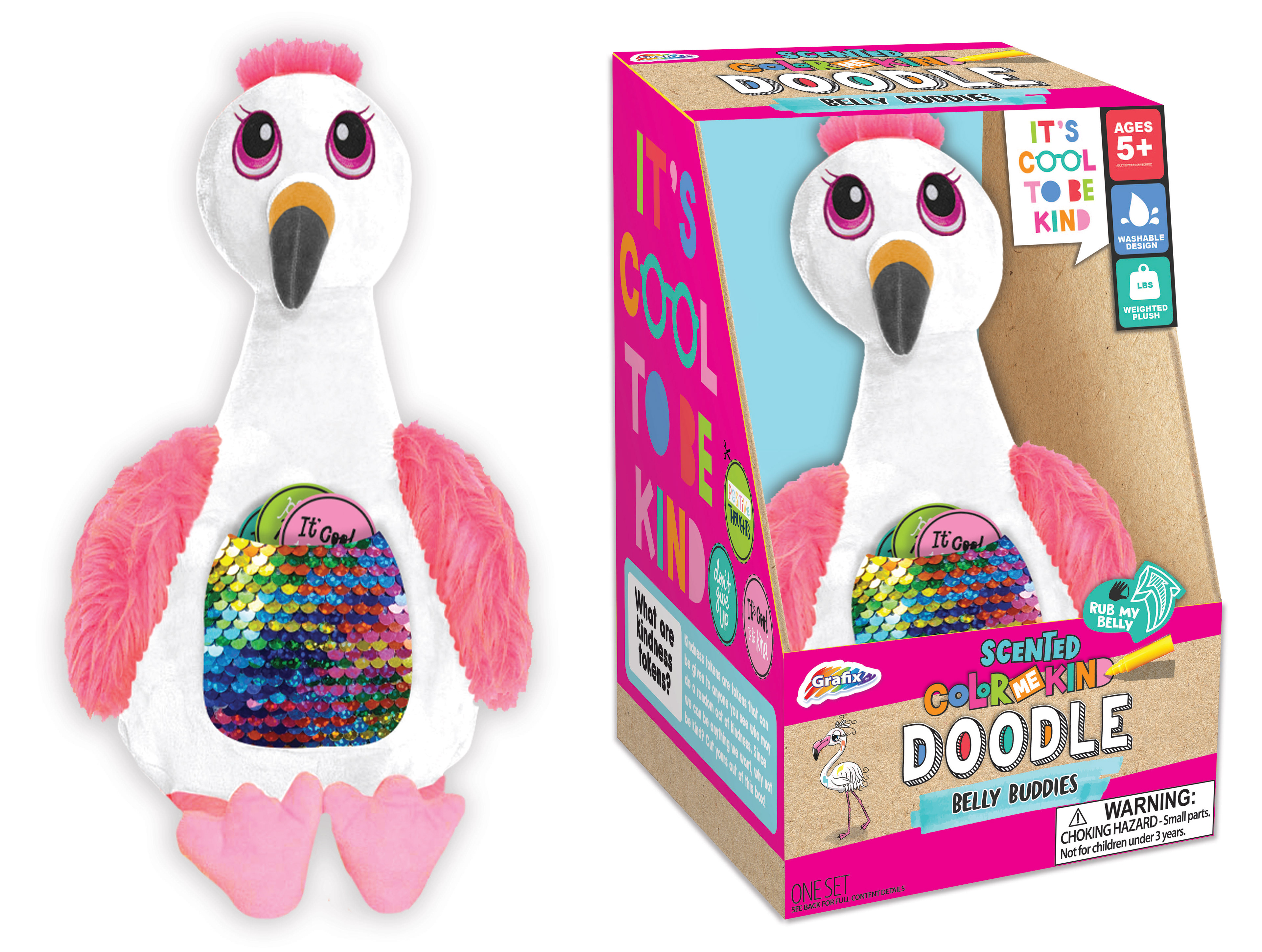
Doodle Belly Buddies – Scented Line
Doodle Belly Buddies was the first project where I had the opportunity to design the actual product, not just the packaging. I created the animal characters in Photoshop, aligning them with the existing style guide for the product line. I selected the color palette, chose the featured characters for the packaging, and updated the logo to reflect the new scented version of Doodle Belly Buddies. This project was a key milestone in my growth as a designer, allowing me to apply both creative direction and brand consistency across multiple elements.


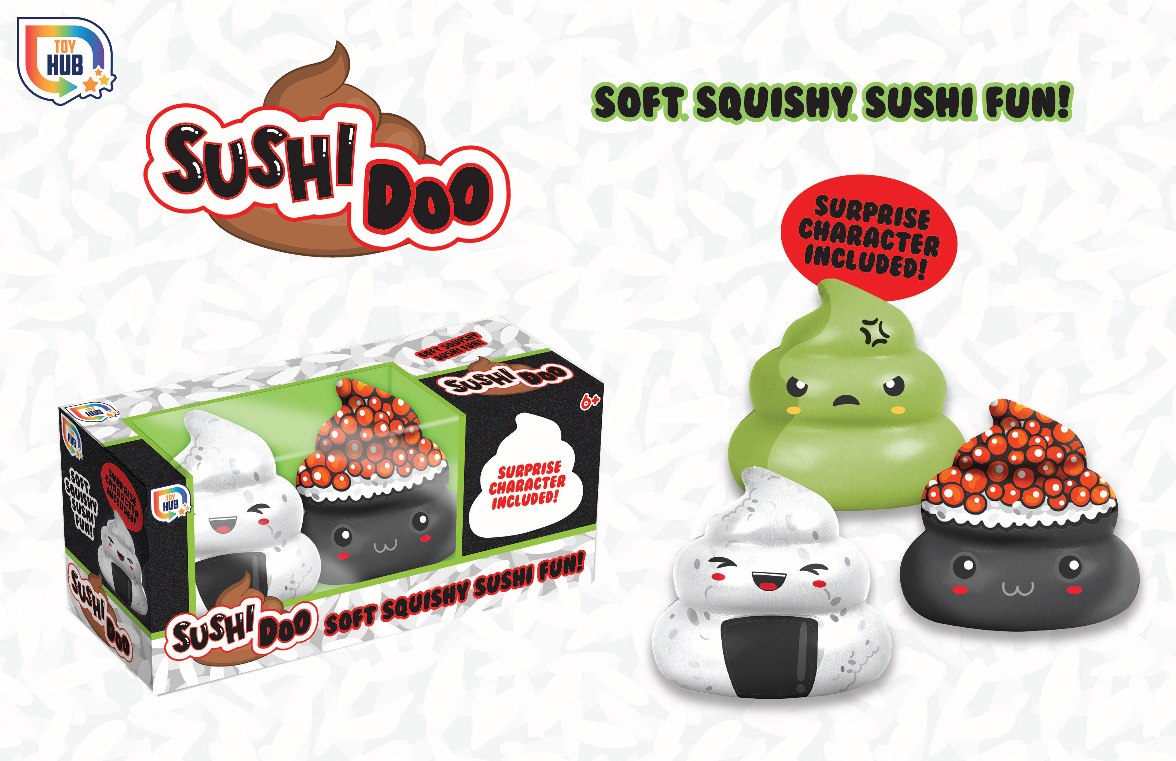
Sushi Surprise Fidget Squishes
I designed this project entirely from scratch, drawing inspiration from current trends in fidget toys, squishies, sushi, and novelty themes like poop. These elements were combined to create a playful and unexpected concept. The packaging is styled to resemble a sushi roll, adding a creative presentation that stands out on shelves. To enhance the unboxing experience, one character is hidden from the window display—adding an element of surprise. The characters themselves feature on-trend Kawaii-style faces to maximize visual appeal and cuteness.
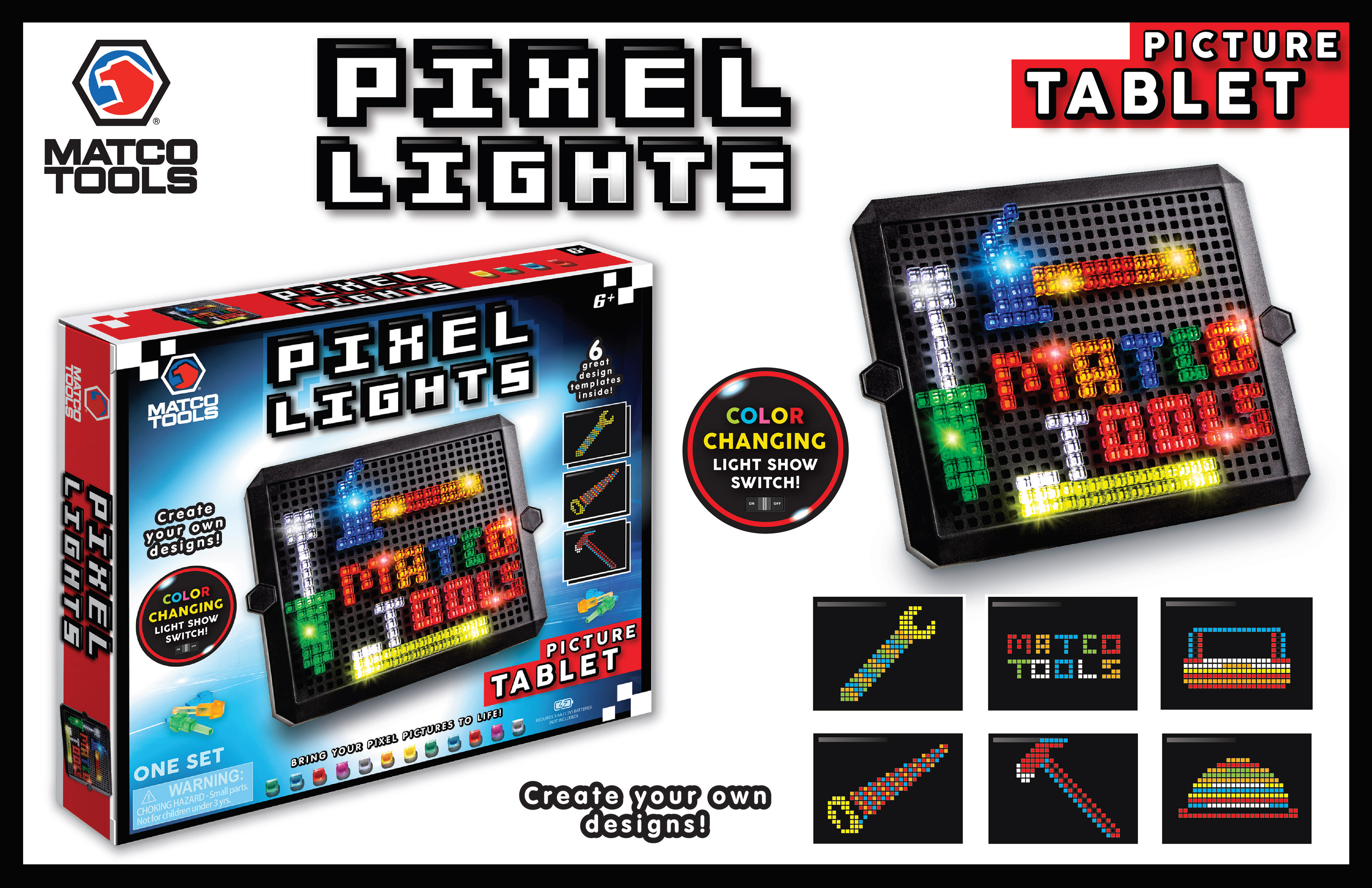
Matco Tools Peg Tablet Project
For this project, I worked within an existing style guide but made several key updates to align the design with the client's needs. I updated the image displayed on the tablet, created new layout templates, and incorporated the Matco Tools logo and brand colors to ensure consistency. The tablet pegs were positioned according to the customer's specific request, and I handled this placement directly in the design phase.
In addition to the design work, I conducted the product photography myself. I then edited the images in Photoshop to enhance sharpness, brightness, and overall visual impact—ensuring the product stood out on the packaging.
Target Seasonal Craft Line – Style Guide & Product Design
For the projects below, I created the full style guide from the ground up, tailored specifically for Target’s preferences. Their team favors clean, simple designs with playful patterns and vibrant, on-trend color palettes. I developed a cohesive visual direction that reflects these preferences while maintaining flexibility across product types.
I also designed the featured sun catchers and ceramic items from scratch in Photoshop, ensuring they aligned seamlessly with the overall aesthetic. This project was a great opportunity to lead both the creative direction and hands-on design execution across multiple formats.


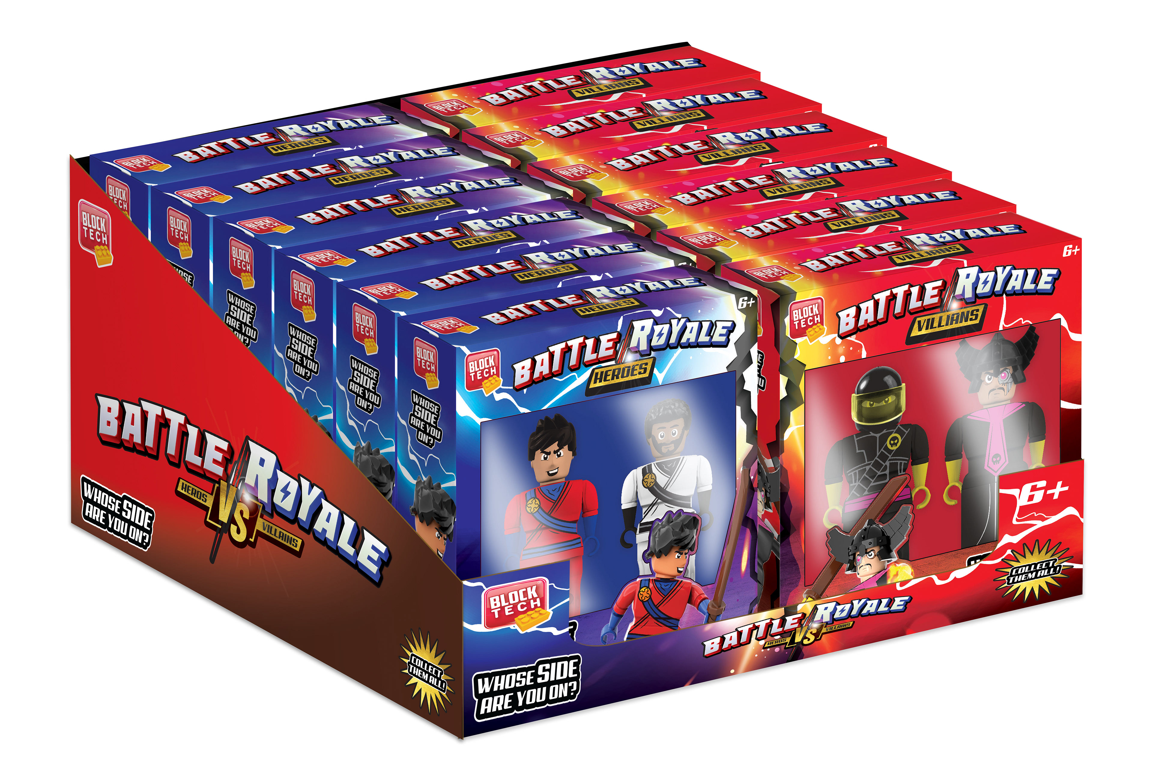
Heroes VS Villains – Block Line Design
Blocks are among the more complex product lines to develop at RMS, requiring a high level of precision and detail. For this "Heroes VS Villains" line, I began by creating detailed specs for each new block figure. Each figure was then built piece by piece using Studio, a specialized 3D modeling program for block construction.
After building, the figures were rendered in high-resolution 3D to ensure maximum visual clarity and realism. I completed the final specs and visual enhancements in Photoshop, adding finishing touches to prepare the designs for production.
Additionally, I updated the "Heroes VS Villains" logo and recreated both the packaging and PDQ (power wing display) artwork, aligning everything with the existing style guide while refreshing the overall look and feel.


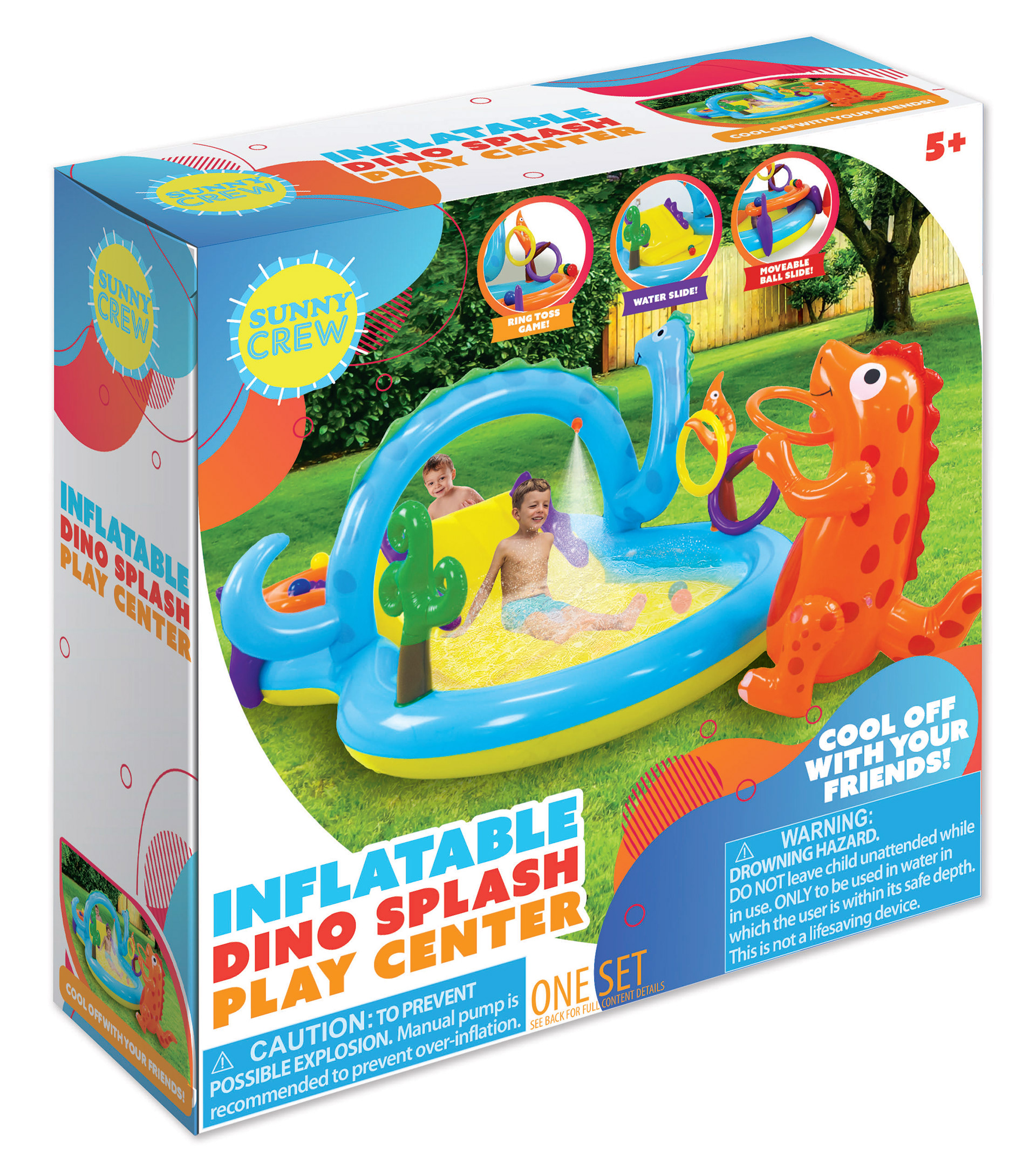
Summer Water Inflatables – Style Guide Creation
I created the style guide for the summer water inflatables shown below, with a focus on capturing the playful, energetic spirit of the season. My goal was to develop a visual identity that was bright, colorful, and reflective of the product category. The shapes and patterns within the guide were intentionally designed to emulate the fluidity and motion of water, reinforcing the fun and refreshing nature of the inflatables themselves. This cohesive and vibrant look helped unify the line across packaging and marketing materials.


Color-Your-Own Pillow – Triceratops Design
For this project, I was asked to develop a new addition to an existing line of color-your-own pillows, specifically a triceratops design to complement the two already in the assortment. I created the full pillow specs myself, ensuring the design was both production-ready and visually consistent with the existing products. I also updated the packaging artwork using the established style guide, maintaining brand continuity while introducing a fresh, engaging new character.

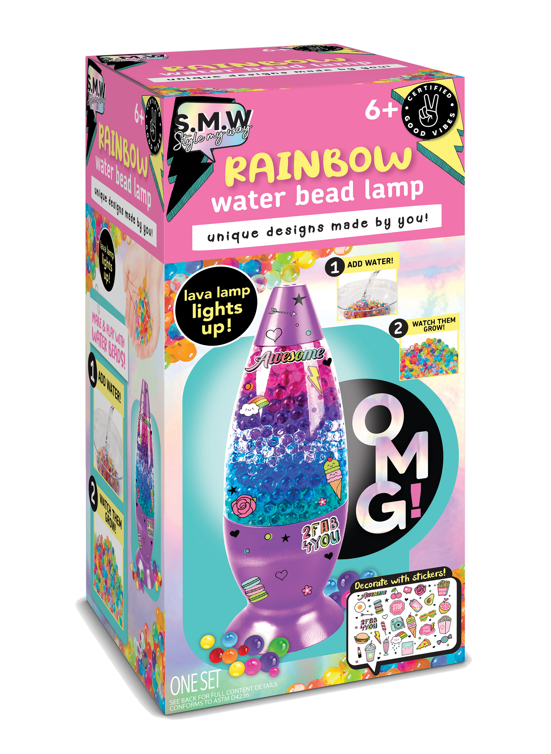
Water Bead Lamp
For the Water Bead Lamp, I worked within an existing style guide to maintain brand consistency, while creating new callouts to better highlight product features. I also handled the Photoshop work for both the lamp and the sticker designs, ensuring the final visuals were clean, vibrant, and production-ready.
For the Water Bead Lamp, I worked within an existing style guide to maintain brand consistency, while creating new callouts to better highlight product features. I also handled the Photoshop work for both the lamp and the sticker designs, ensuring the final visuals were clean, vibrant, and production-ready.
Chalk & Bubble Wands – ALDI Exclusive
This project was developed specifically for ALDI, following their proprietary branding guidelines. I was tasked with designing new head shapes for the bubble wands and creating fresh imagery for the accompanying stickers. The goal was to keep the designs fun and eye-catching, while aligning with ALDI’s brand identity.
This project was developed specifically for ALDI, following their proprietary branding guidelines. I was tasked with designing new head shapes for the bubble wands and creating fresh imagery for the accompanying stickers. The goal was to keep the designs fun and eye-catching, while aligning with ALDI’s brand identity.


Butterfly and Fox Planters
The butterfly and fox planter illustrations shown above were created in Adobe Illustrator specifically for a client presentation. These vector drawings were designed to clearly communicate the concepts and appeal of the products.
The butterfly and fox planter illustrations shown above were created in Adobe Illustrator specifically for a client presentation. These vector drawings were designed to clearly communicate the concepts and appeal of the products.
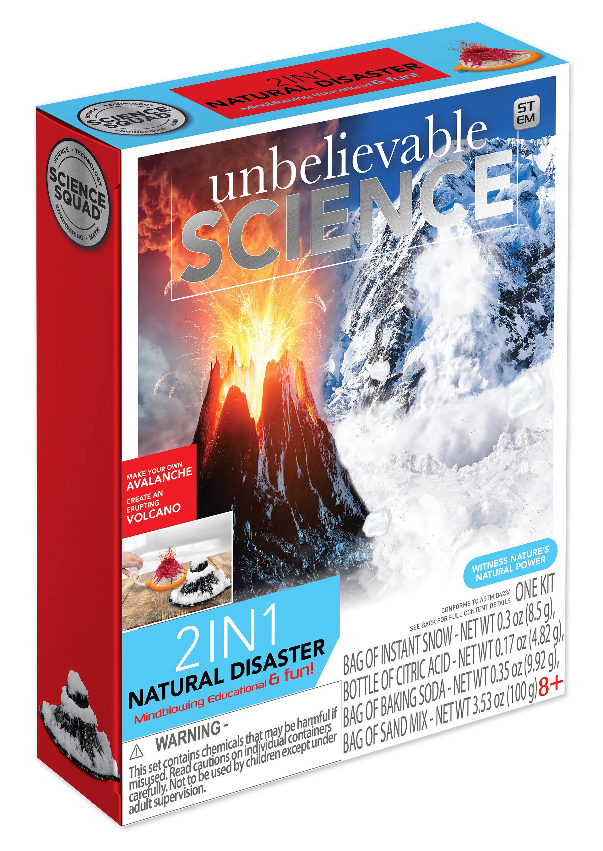
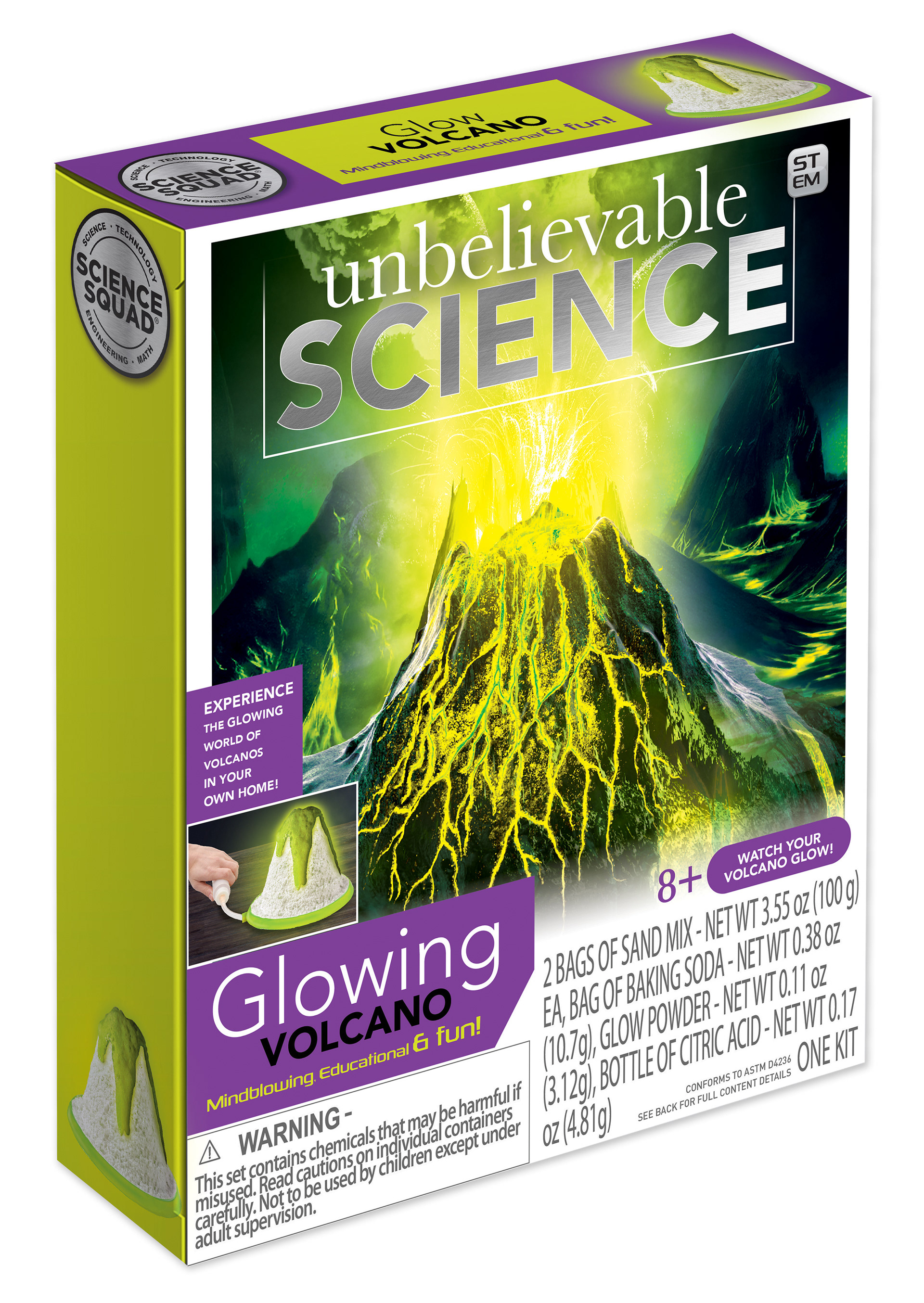
Science Kits Packaging Update
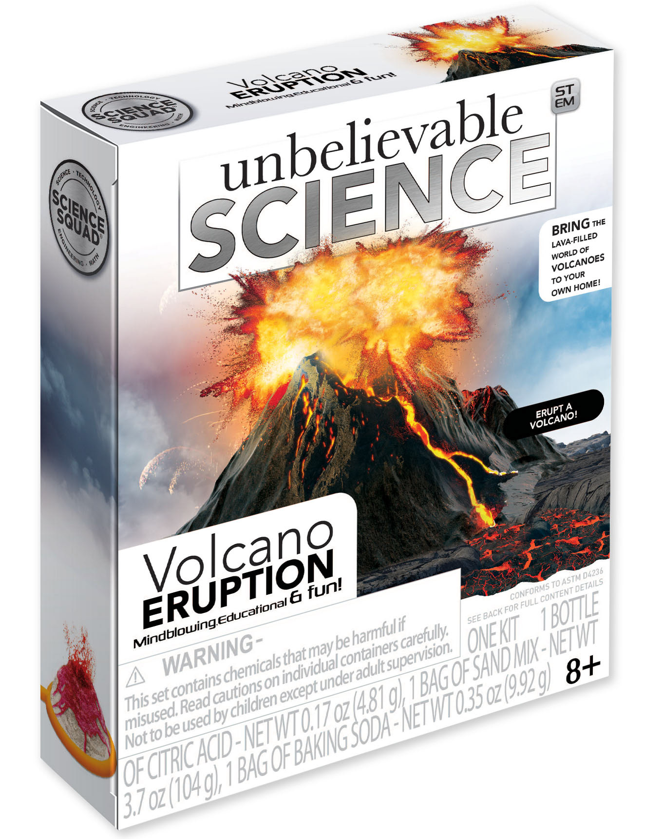
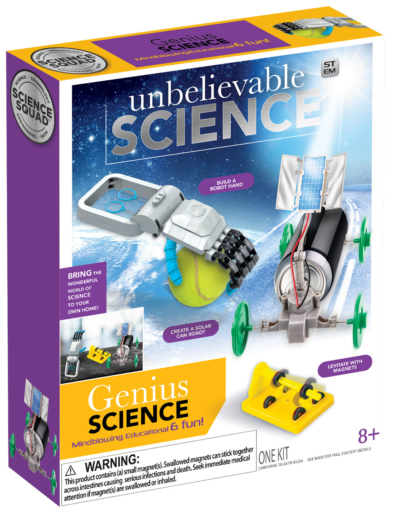
Science kits are among the more complex product lines to work on. The white packaging reflects the updated 2022 style guide, while the three colorful boxes represent the previous design. I resized and refreshed the packaging layouts, enhanced the product images in Photoshop, and built the reps for the white boxes. Additionally, I retouched the imagery on the older style boxes to improve visual consistency and appeal.
Science kits are among the more complex product lines to work on. The white packaging reflects the updated 2022 style guide, while the three colorful boxes represent the previous design. I resized and refreshed the packaging layouts, enhanced the product images in Photoshop, and built the reps for the white boxes. Additionally, I retouched the imagery on the older style boxes to improve visual consistency and appeal.


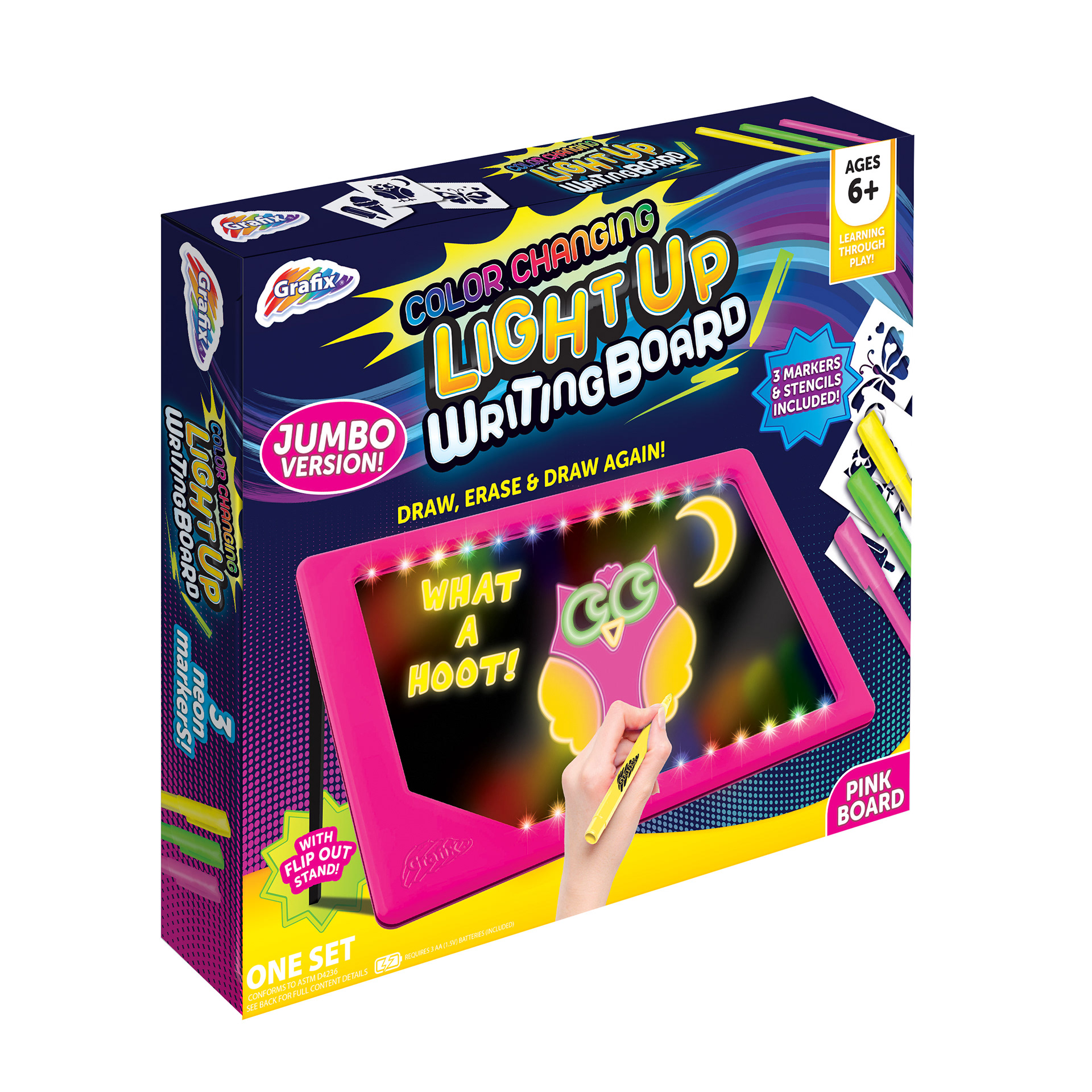
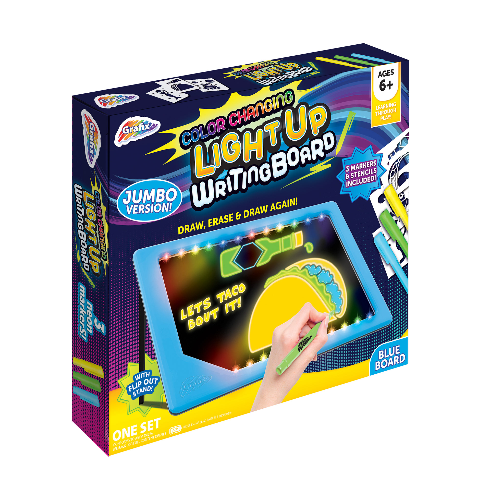
Color-Changing Light-Up Drawing Boards
The items below were originally simple light-up drawing boards. I was tasked with updating the line to feature color-changing technology. This involved redesigning the logo and callouts to reflect the new functionality, creating fresh imagery for the boards, and developing new stencils to enhance the user experience. These updates helped refresh the product line and increase its appeal to a broader audience.
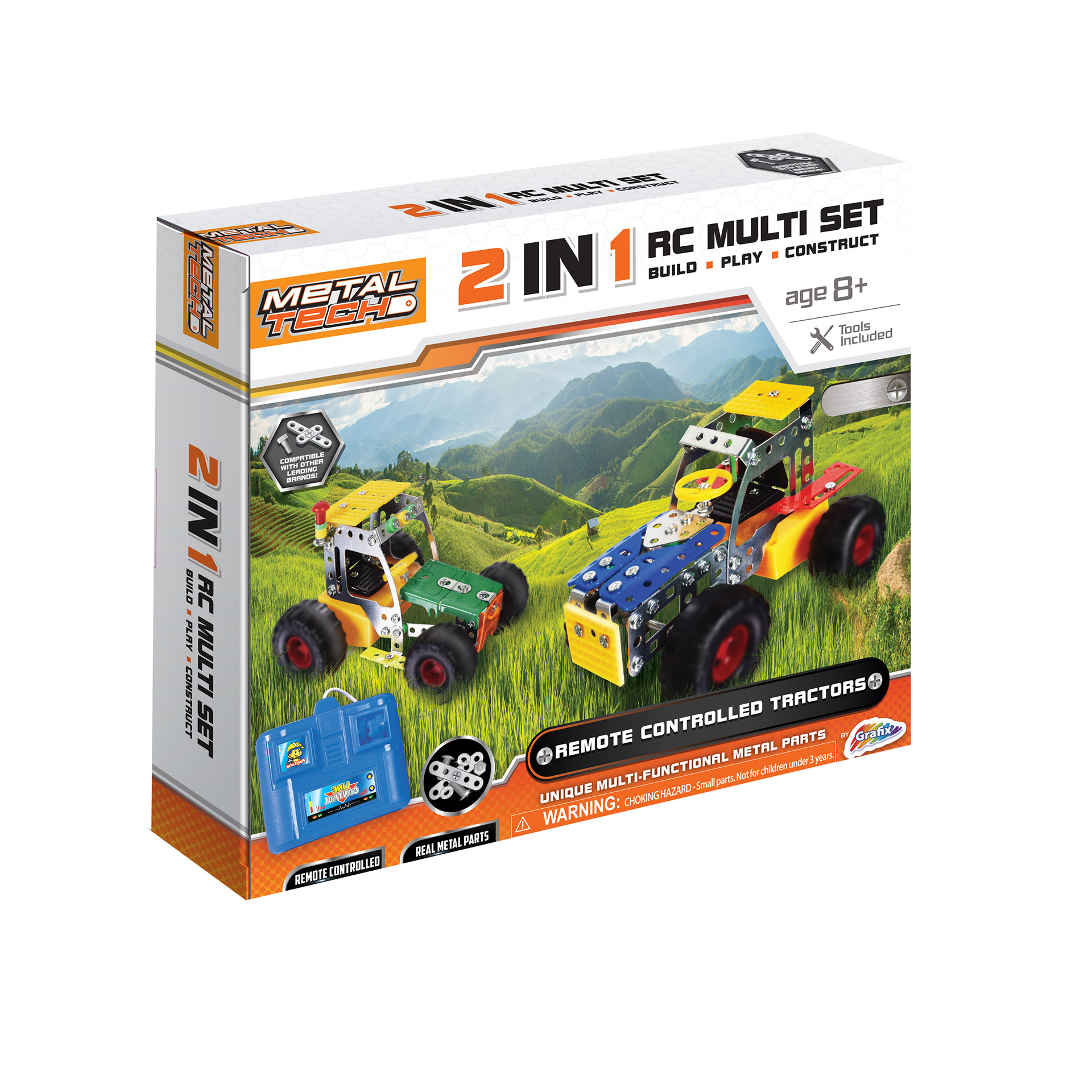
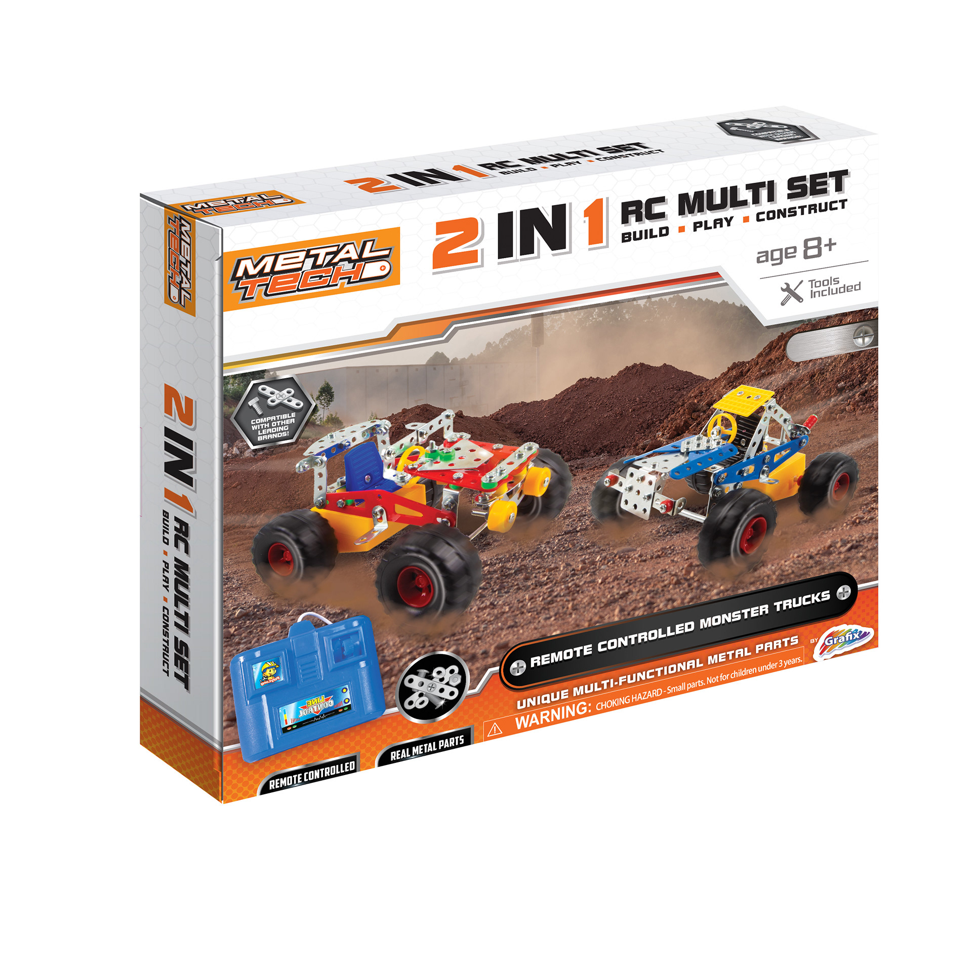
Metal Tech Projects
For the Metal Tech projects shown below, my role focused on enhancing product imagery through Photoshop. I edited the images to create a more dynamic and action-packed look, giving the builds a sense of motion and excitement.
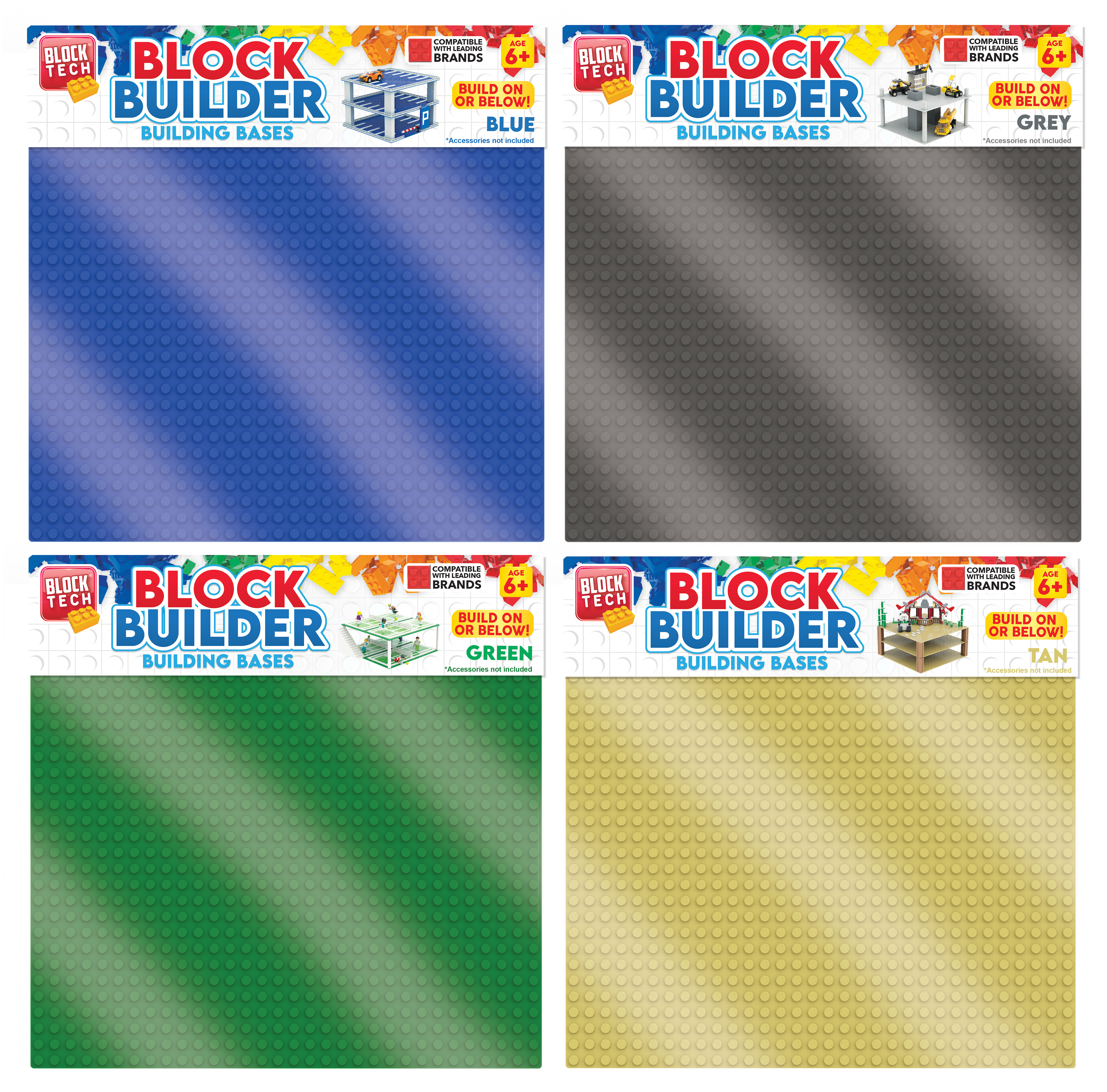
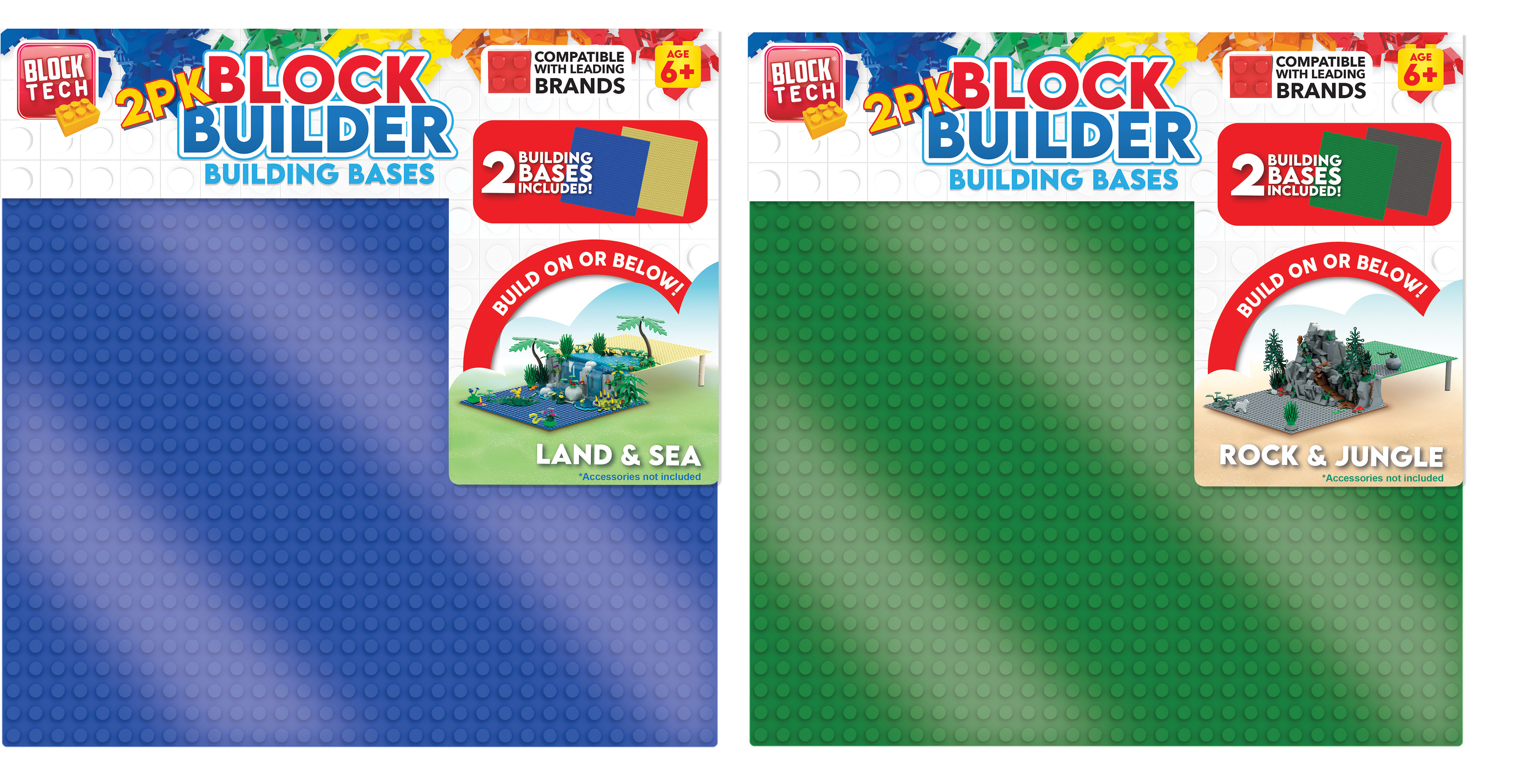
Block Tech Base Plates
I updated the callouts and refreshed the style guide for the Block Tech Base Plates, ensuring alignment with the existing new style guide. Additionally, I added the block builds onto the two packaging designs to better showcase the product in use.
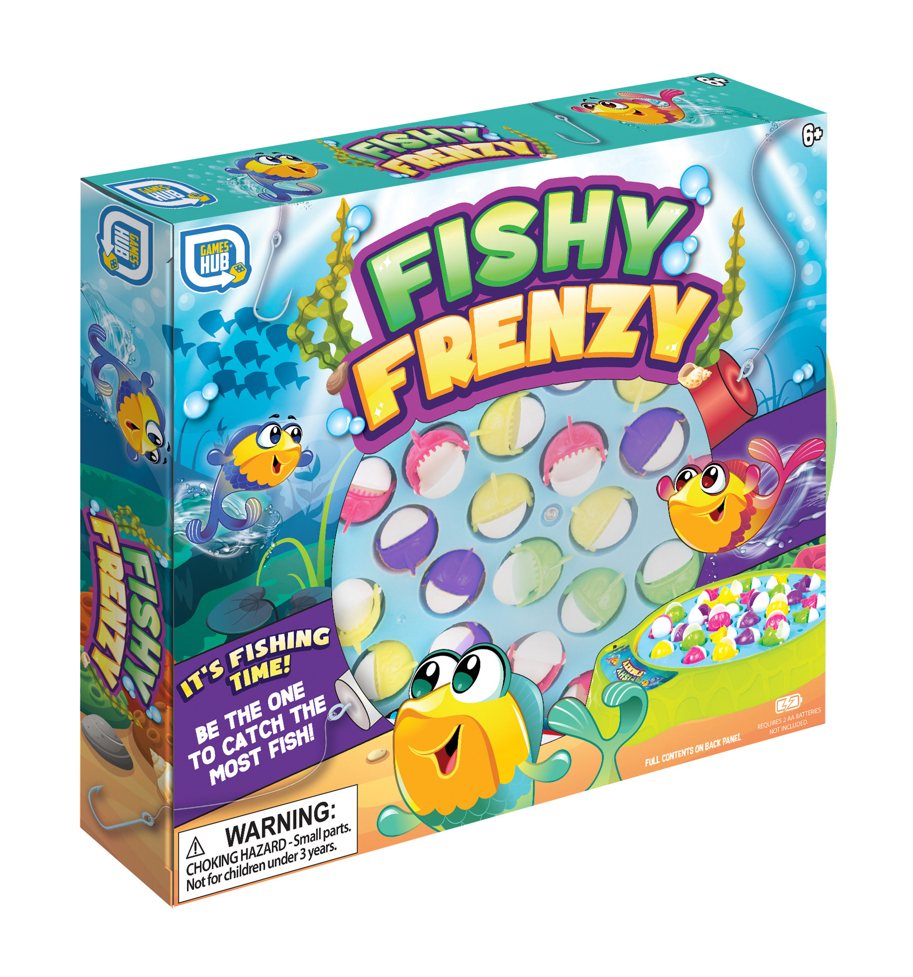
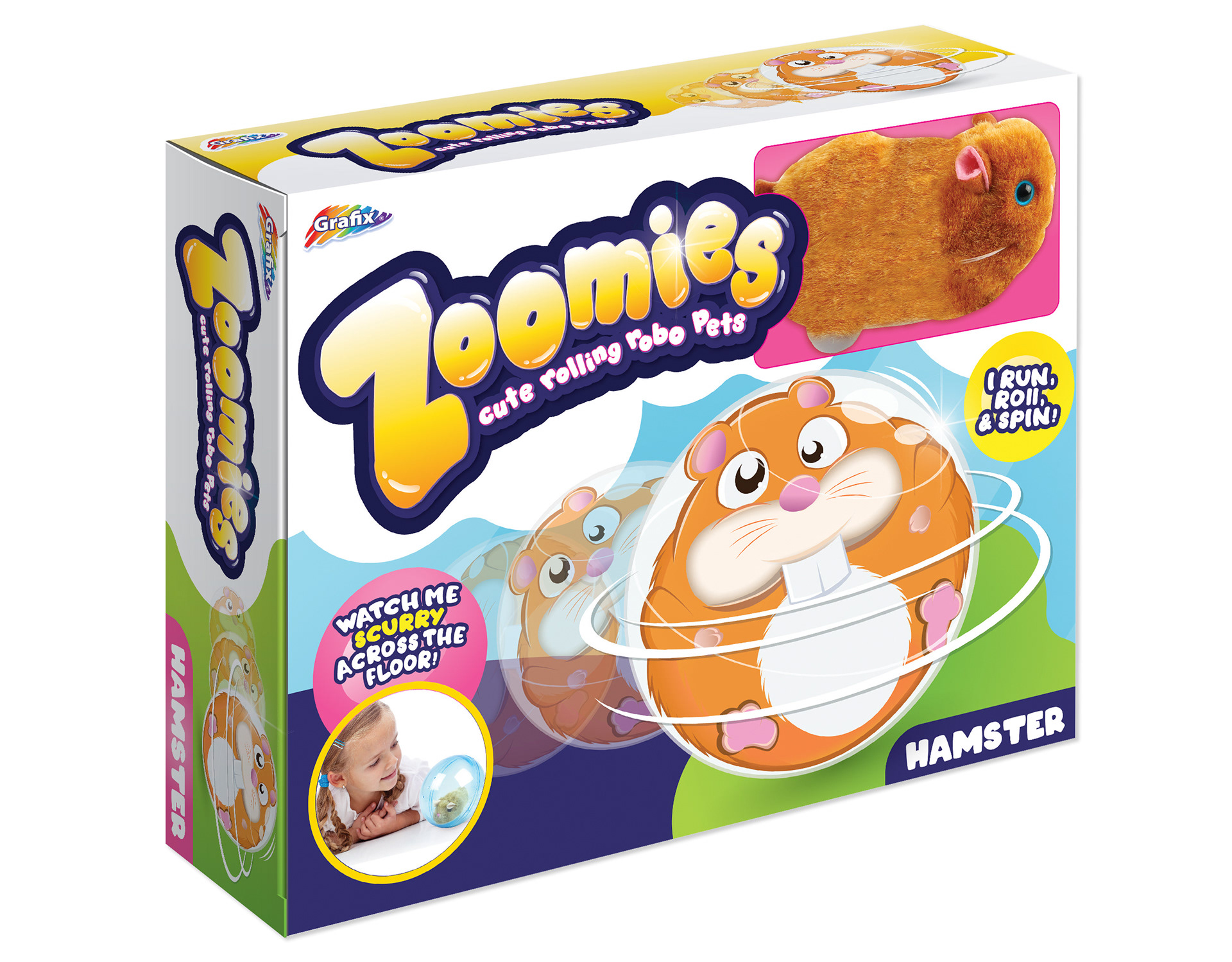
Fishy Frenzy Game & Zoomies Pet Projects
I developed the complete style guides for both the Fishy Frenzy Game and Zoomies Pet projects, establishing cohesive visual directions tailored to each product line.
I developed the complete style guides for both the Fishy Frenzy Game and Zoomies Pet projects, establishing cohesive visual directions tailored to each product line.
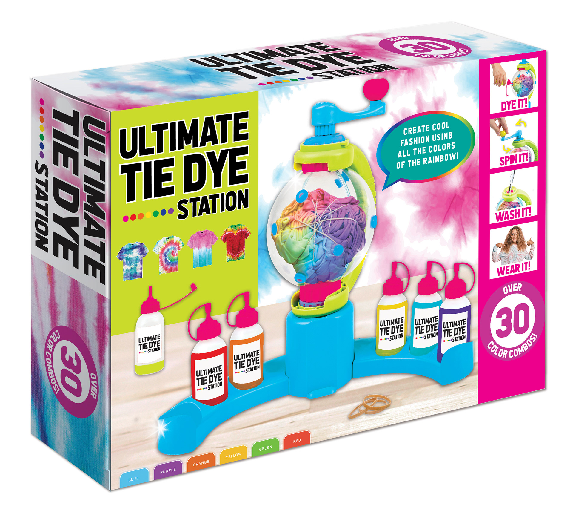
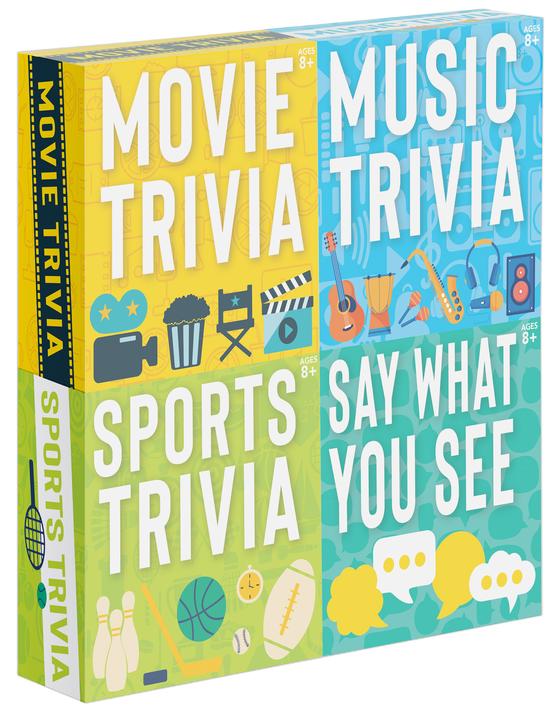
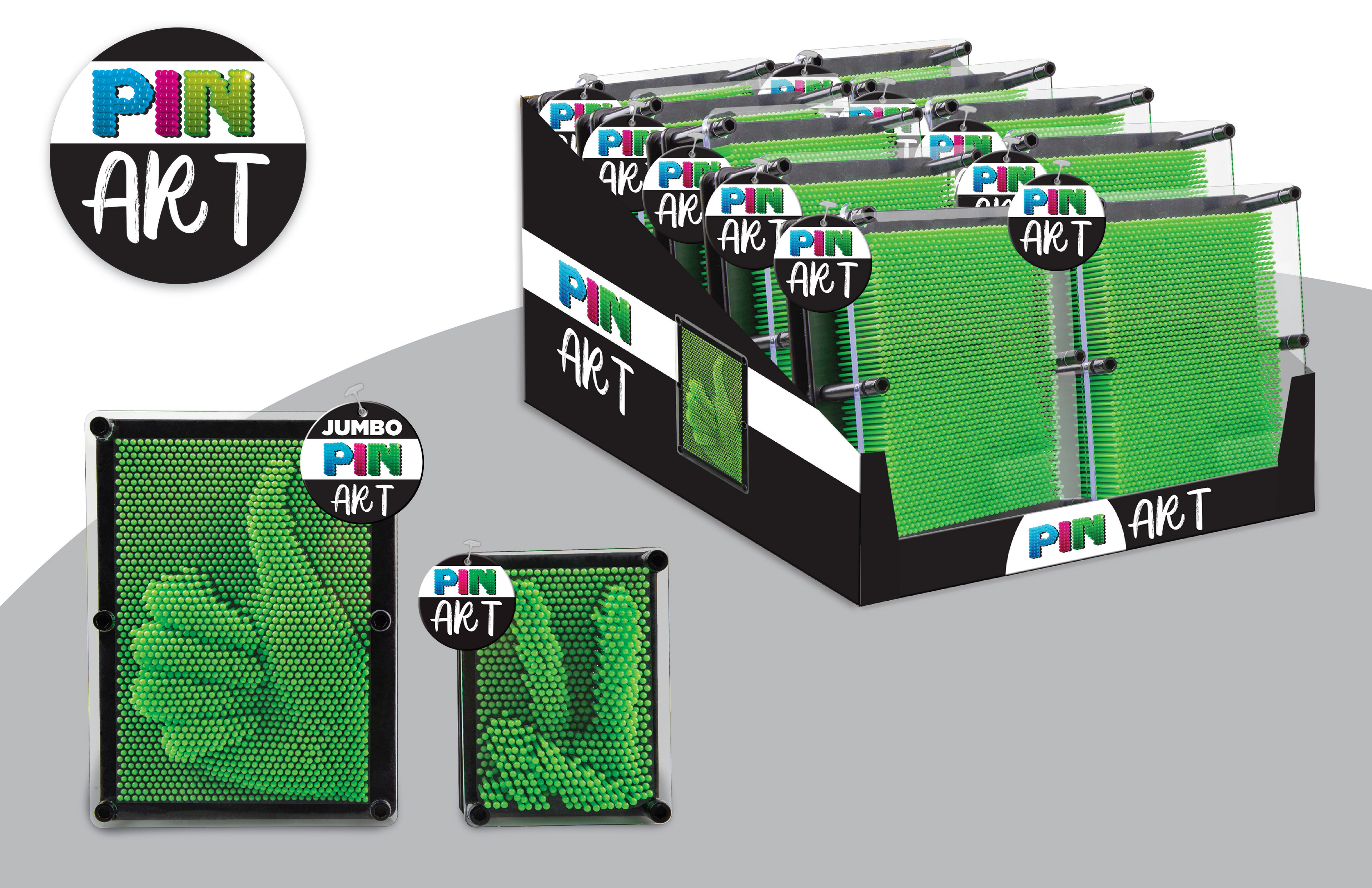
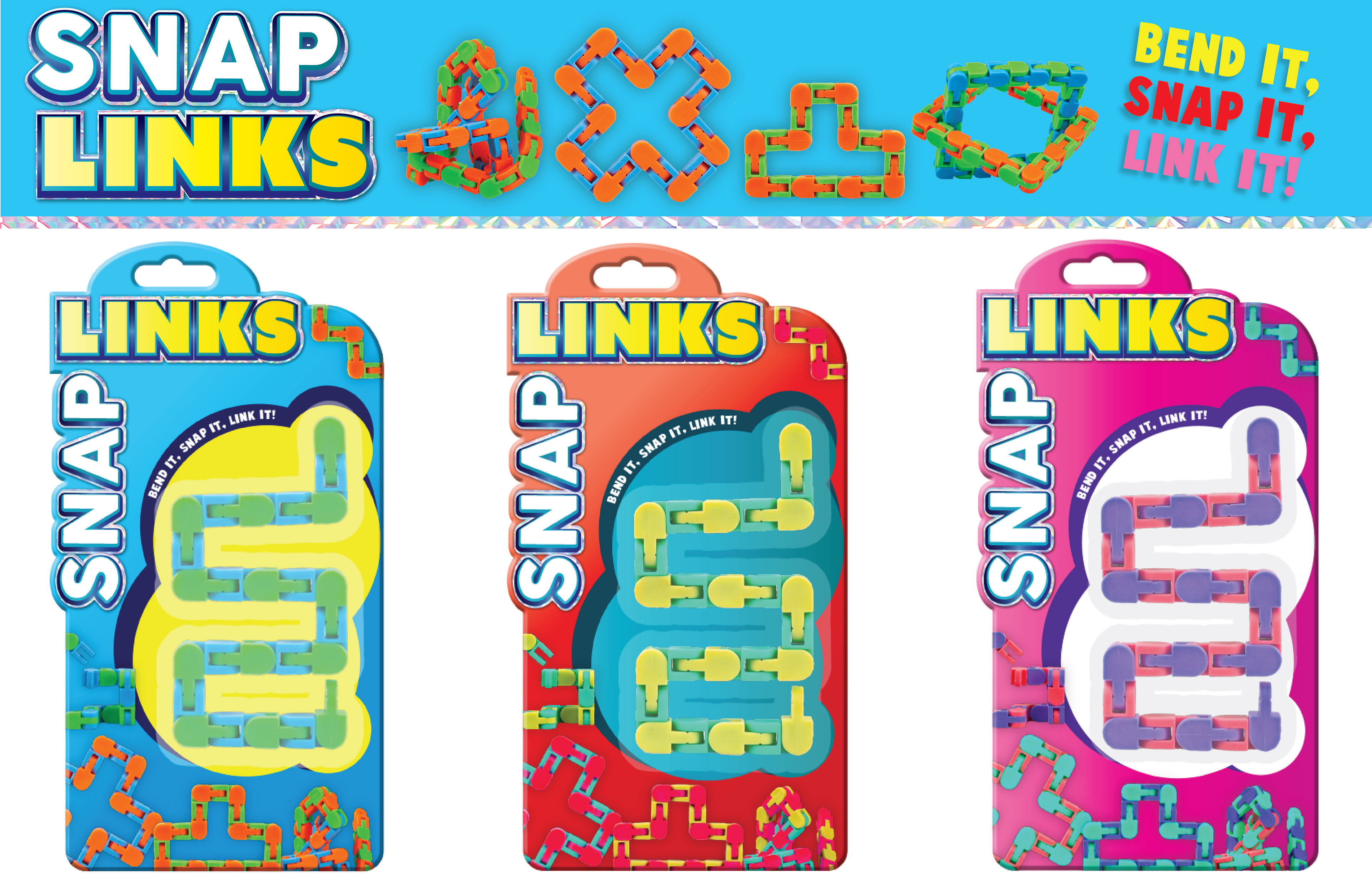
Additional Projects
For the other assorted projects shown below, I contributed extensively through Photoshop work—selecting new imagery and characters, creating impactful callouts, and handling product photography. These efforts helped refresh the product presentation and enhance overall shelf appeal.
For the other assorted projects shown below, I contributed extensively through Photoshop work—selecting new imagery and characters, creating impactful callouts, and handling product photography. These efforts helped refresh the product presentation and enhance overall shelf appeal.
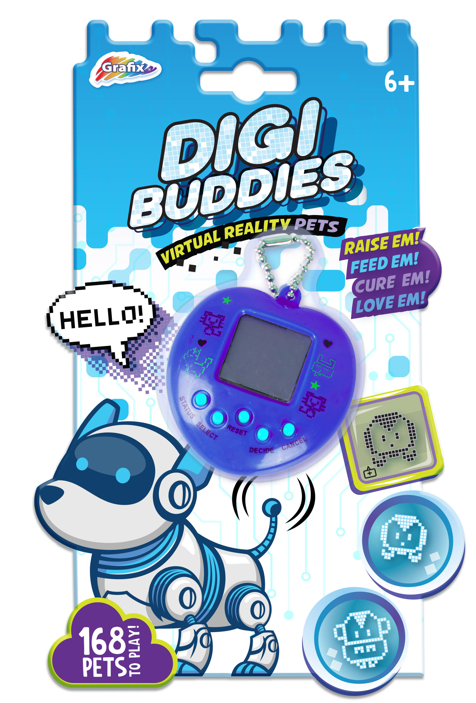
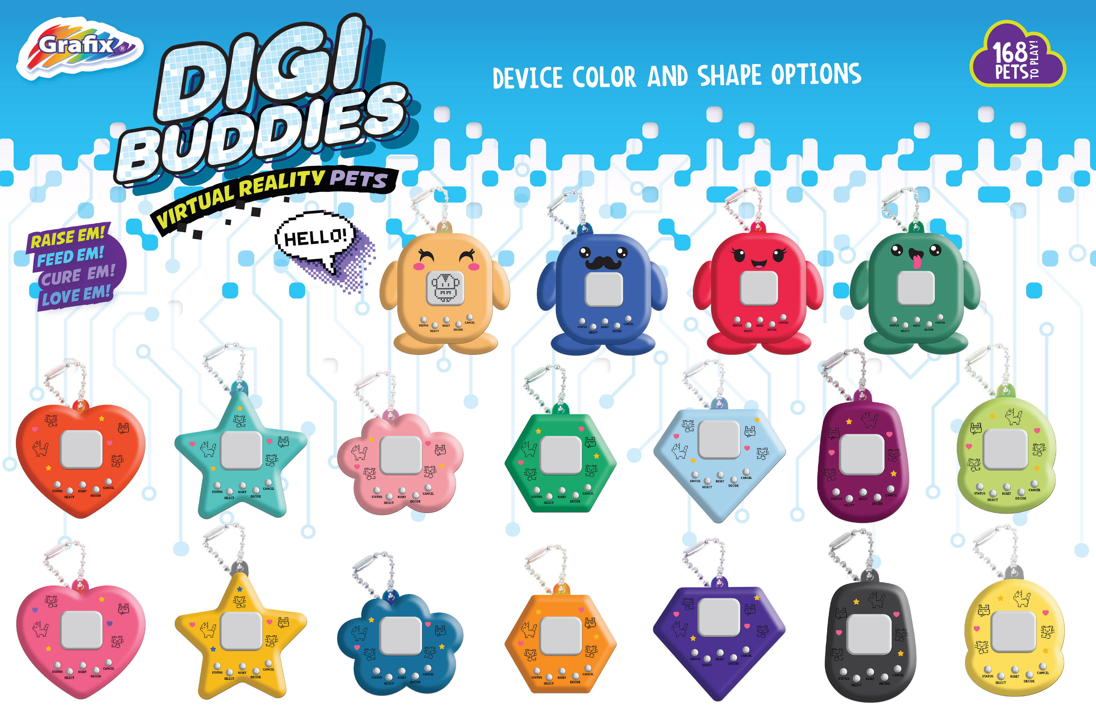
Digi Buddies Virtual Pets
I was tasked with designing new shapes and color options for the Digi Buddies Virtual Pets shown above. Additionally, I created a new packaging cutter and made subtle adjustments to the artwork to enhance shelf presence and functionality.
I was tasked with designing new shapes and color options for the Digi Buddies Virtual Pets shown above. Additionally, I created a new packaging cutter and made subtle adjustments to the artwork to enhance shelf presence and functionality.
Mini Locker Set Presentation
The Mini Locker Set was a fun project I developed for Target’s back-to-school grab bins. I created the presentation to showcase the product’s appeal and suitability for the season, focusing on clean, engaging visuals.
The Mini Locker Set was a fun project I developed for Target’s back-to-school grab bins. I created the presentation to showcase the product’s appeal and suitability for the season, focusing on clean, engaging visuals.

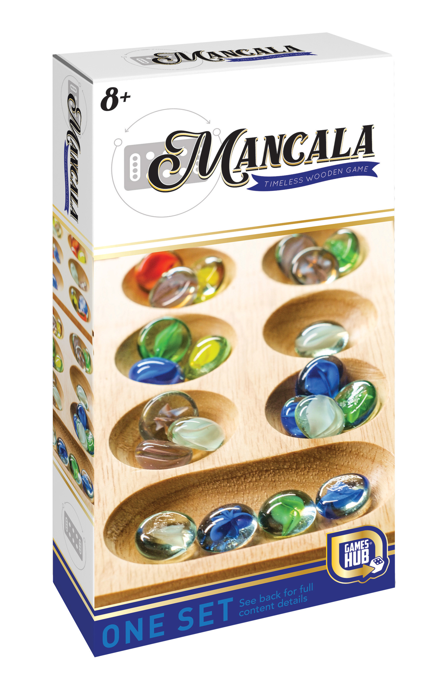
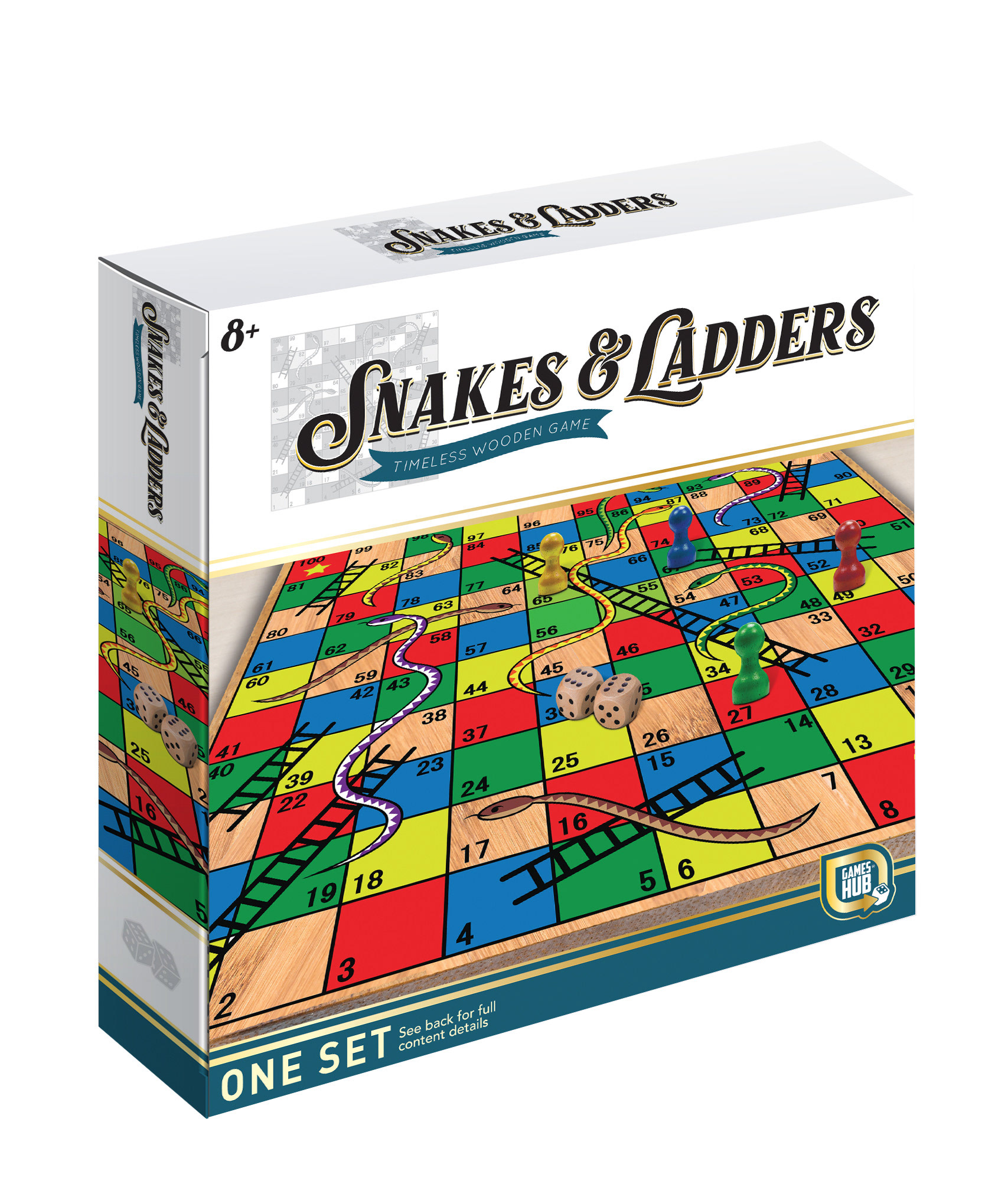
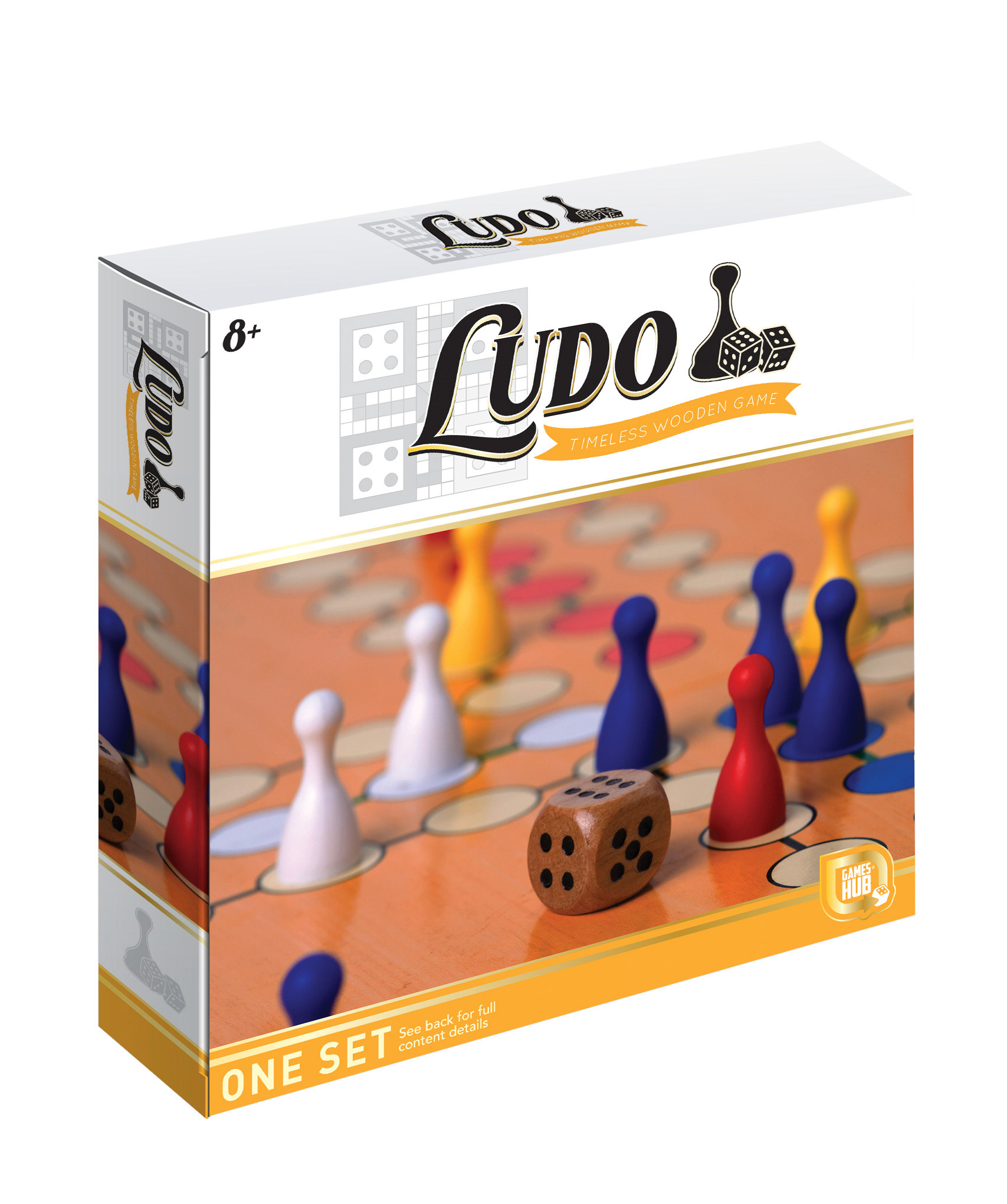
Game Packaging Update
For the games below, I worked within an existing style guide to ensure brand consistency while updating the imagery. I also photoshopped new wooden snakes and ladders to refresh the visuals and enhance the packaging appeal.
Water Color Reveal & Crayon by Number
Using an existing style guide, I designed new imagery for the Water Color Reveal product. For the Crayon by Number line, I updated the packaging by incorporating existing images into a new carrying case format, refreshing the product’s presentation and functionality.


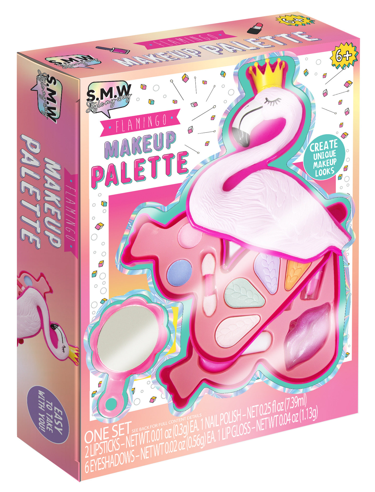
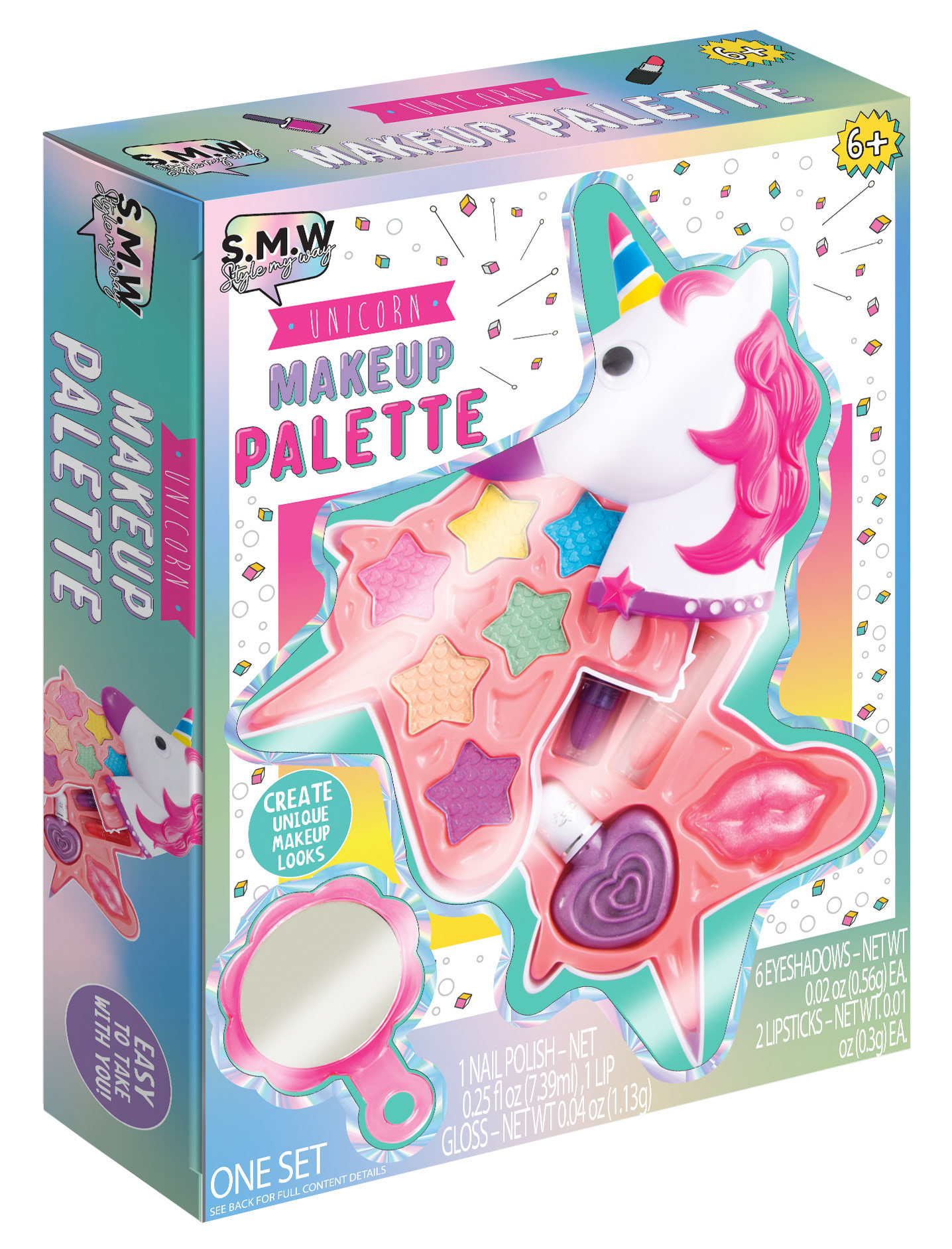
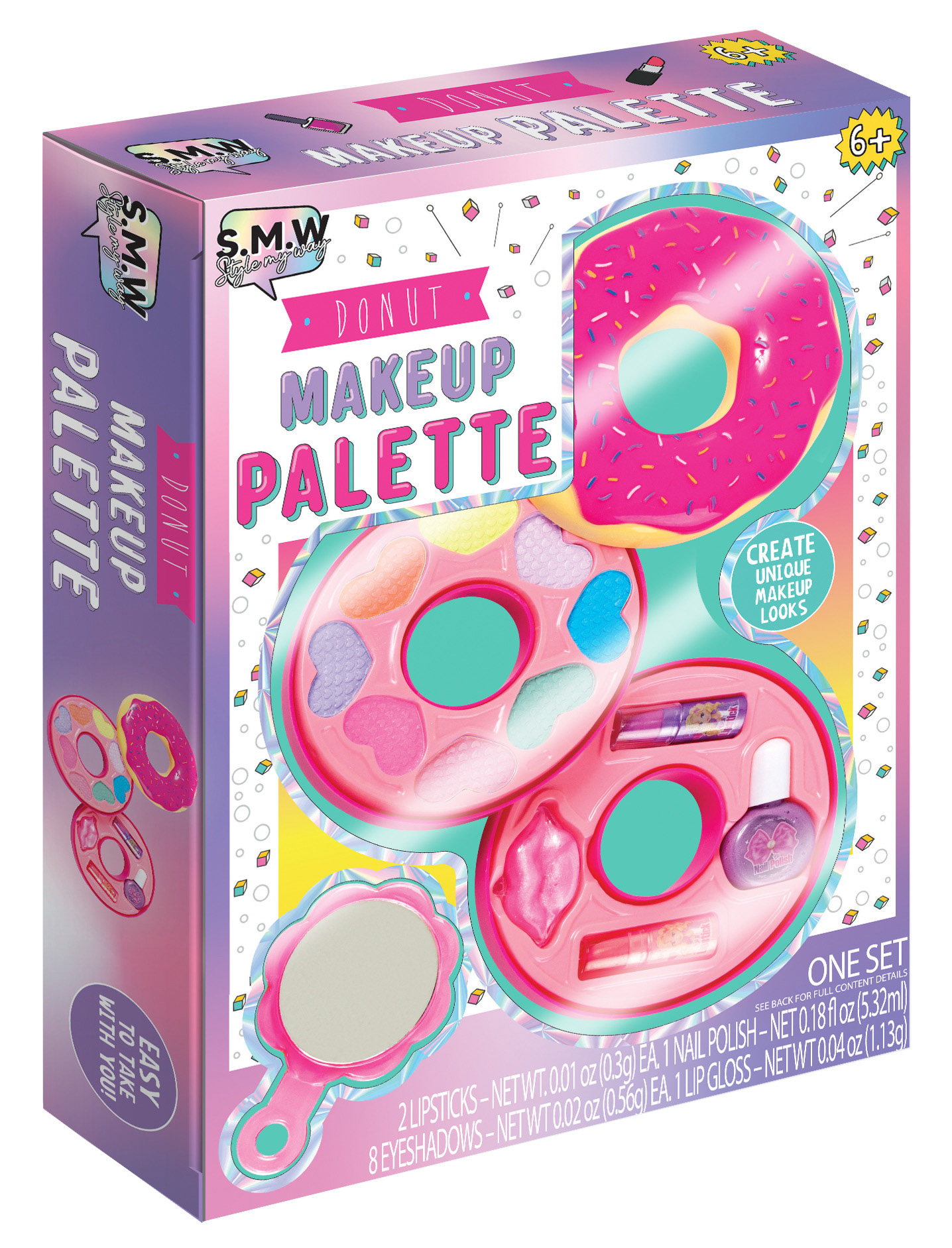
Make Up Palettes Artwork Update
I updated the artwork for the Make Up Palettes to align with a newer existing style guide. Additionally, I built the reps in Photoshop to ensure the designs were production-ready and visually appealing.
Presenter Pages for Multiple Customers
Below are presenter pages I created for existing products, adapting them into alternative style guides tailored to different customers. This involved customizing layouts, visuals, and branding elements to meet each client’s unique requirements while maintaining product consistency.
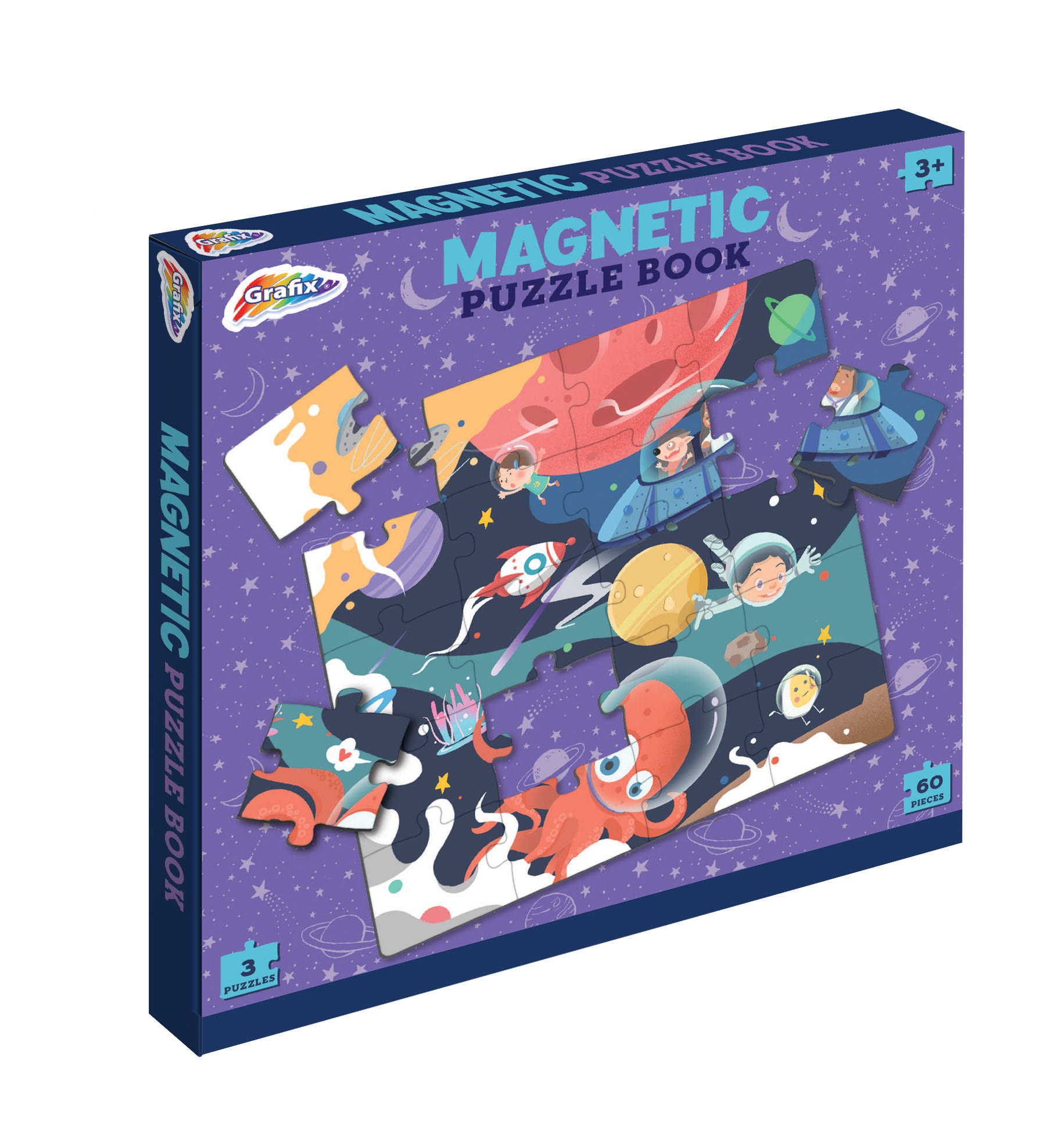
Magnetic Puzzle Boxes
I resized and updated the style guide for the magnetic puzzle boxes shown below, and introduced a new mermaid-themed option to expand the line.
I resized and updated the style guide for the magnetic puzzle boxes shown below, and introduced a new mermaid-themed option to expand the line.
Rummy Game
The Rummy game was designed entirely from scratch, with a larger format specifically tailored for small children’s hands to enhance playability.
The Rummy game was designed entirely from scratch, with a larger format specifically tailored for small children’s hands to enhance playability.
Dry Erase Markers
Using an existing style guide, I developed the dry erase marker packaging and built the reps in Photoshop, ensuring the visuals were crisp and production-ready.
Using an existing style guide, I developed the dry erase marker packaging and built the reps in Photoshop, ensuring the visuals were crisp and production-ready.


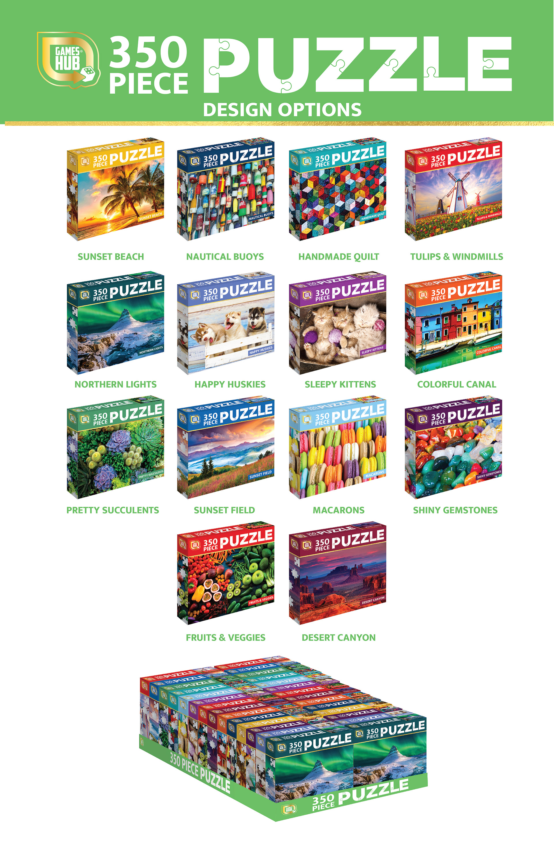
Puzzle Assortment Expansion
I added six new puzzles to the assortment shown below and created all the reps, including the PDQ displays, using Photoshop. Additionally, I designed the presenter page specifically tailored for Dollar Tree, ensuring the product presentation aligned with their retail standards.